Every bookit business can now arrange its own booking page — no waiting list, no add-on, no extra charge. The editor has been on for everyone since September.
What nobody tells you is which sections are worth adding, which order they belong in, and which ones quietly do nothing. That is what this is.
None of this is Miniprogram Pro. Everything below is free on your existing plan. (If you are looking for the customer login, the packages your customers can read themselves and the wallet member card, that is Miniprogram Pro, and it is a different article.)
Where the editor lives
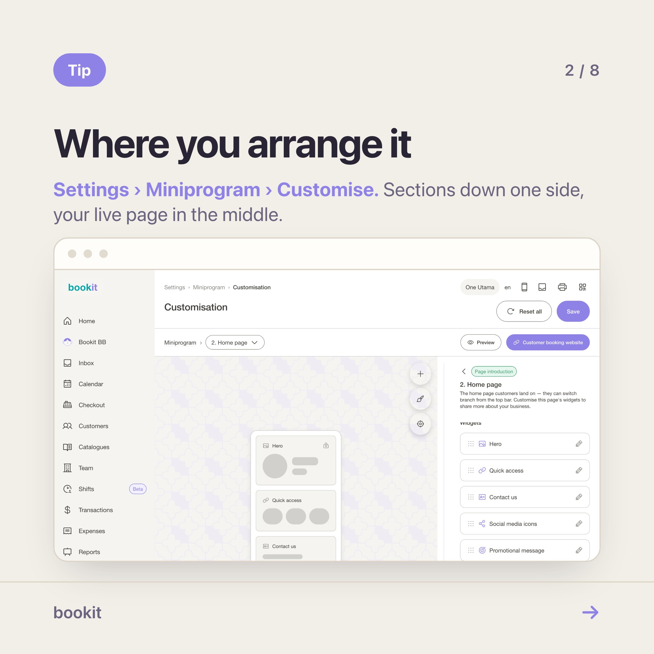
Settings → Miniprogram → Customisation → Customise.
A preview in the middle, the sections of the current page listed down one side, a page selector along the top. You drag a section by its handle; the preview follows.
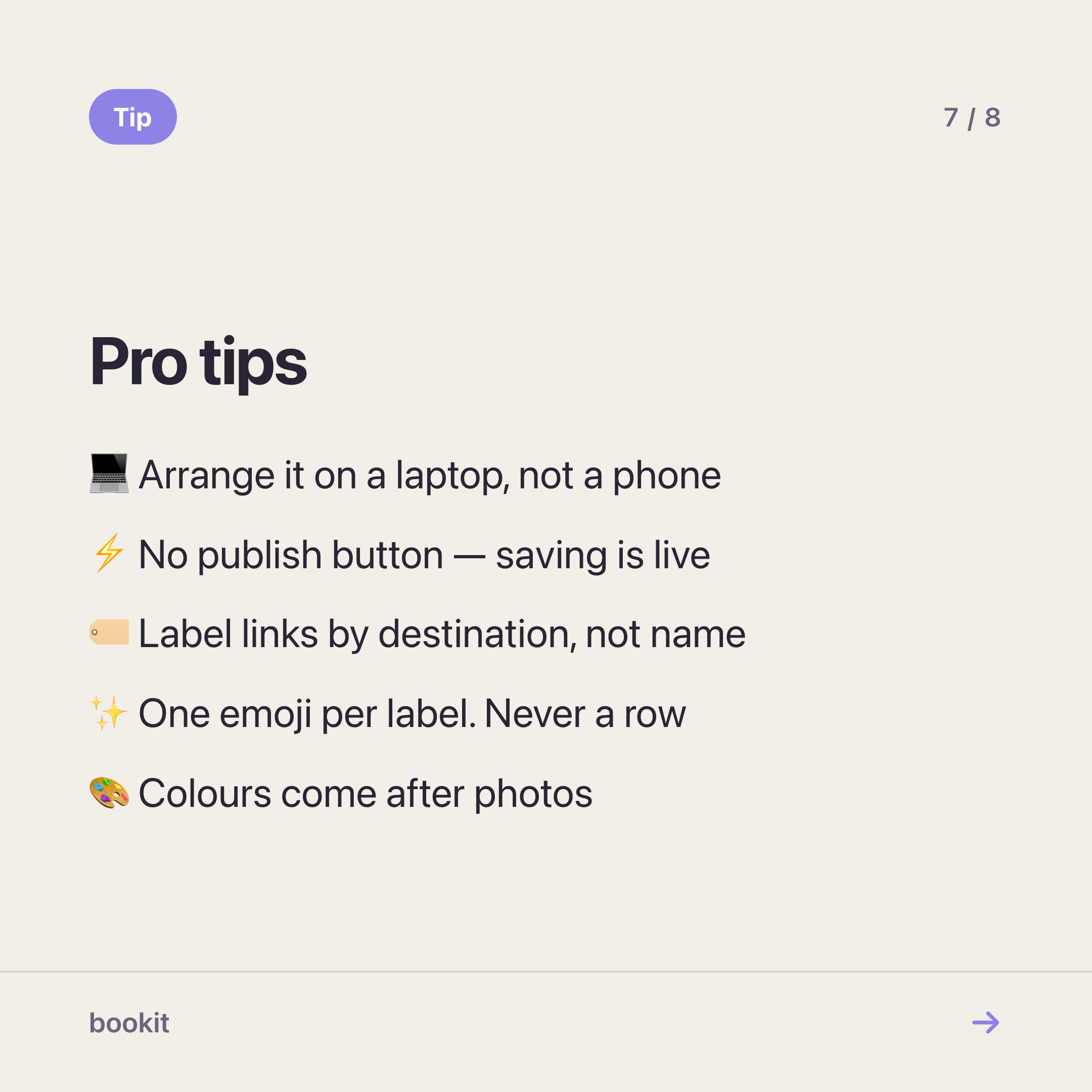
Do it on a laptop. It is a canvas you pan and zoom, and on a phone screen you will spend the whole time fighting it.
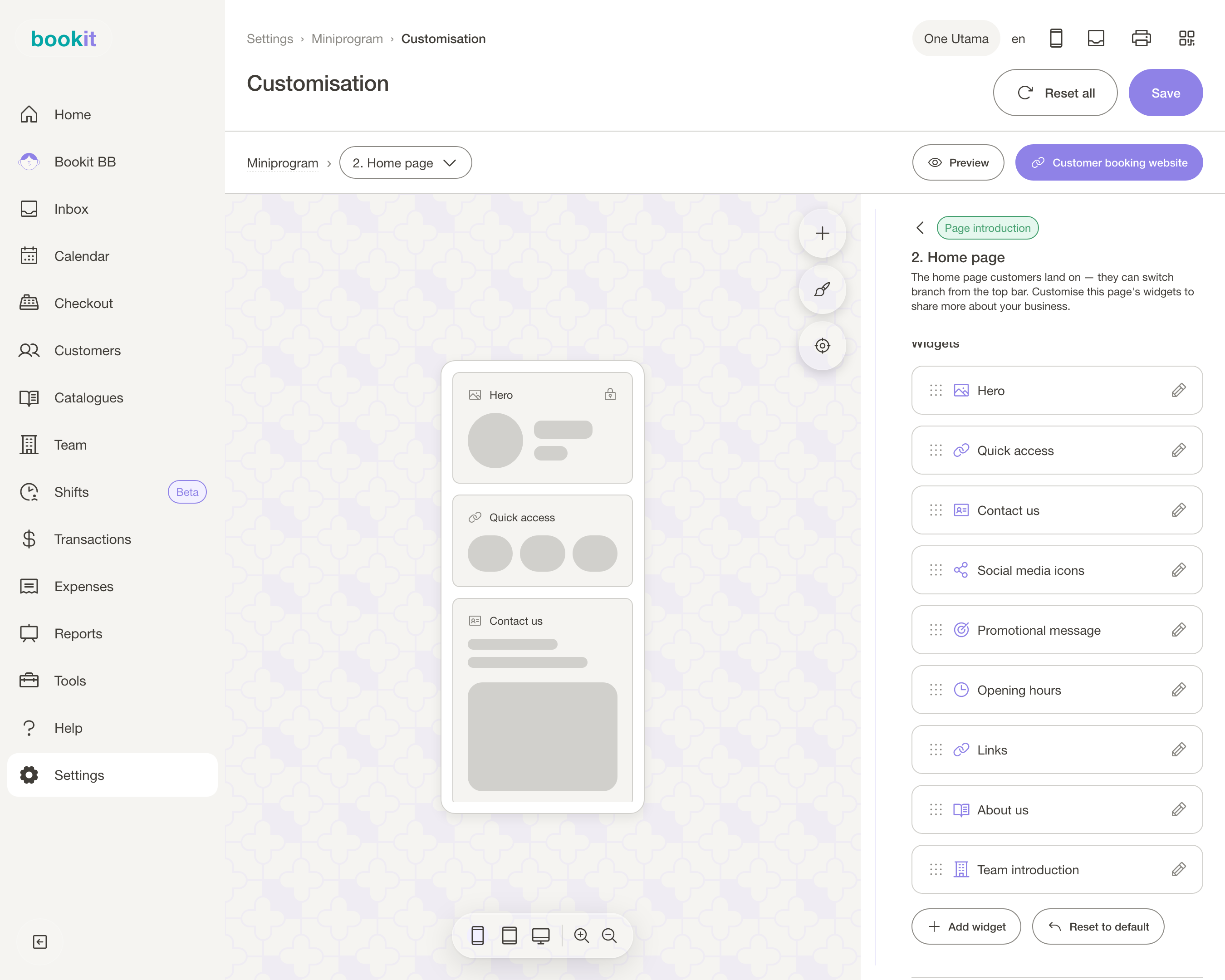
There is no publish button. Saving writes to the page your customers open.
Which pages take your changes
The page selector at the top of the editor lists every screen a customer can land on. Four of them are yours to arrange; the rest are built from your catalogue and your rota, so there is nothing to drag.
The four that are yours, in the order a customer meets them:
- 🏠 Home page — the thirteen sections below. This is the one worth your time
- 📋 Book page / Select service — how your service list reads, plus a text or photo block around it
- 🎉 Confirmation — the screen after a booking. A text block or a photo
- 🔒 Login and Member profile — padlocked until Miniprogram Pro is on your subscription
Select date, Select team member and Review are fixed. They are built from your availability, your rota and the booking itself, so there is nothing to drag.
The thirteen sections, and what each is actually for
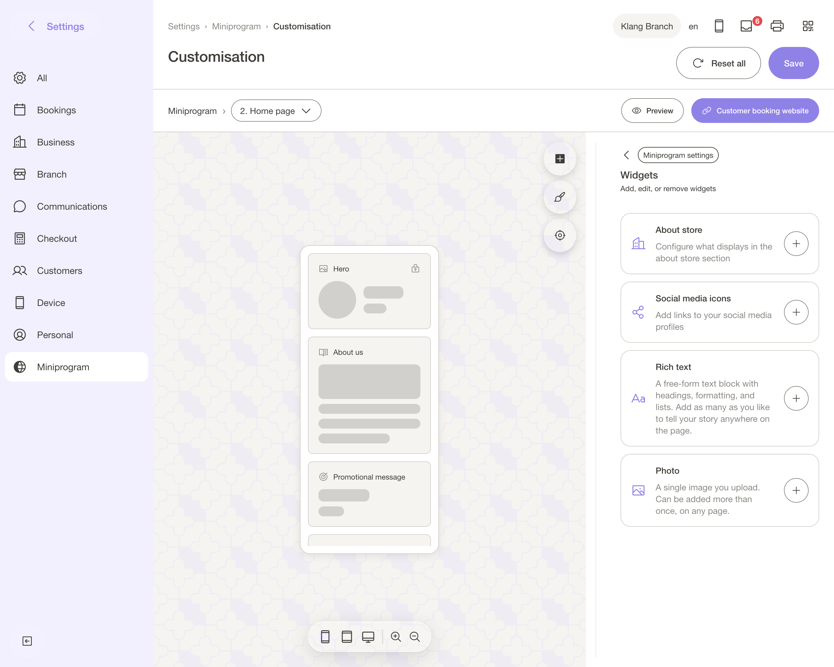
The ones most businesses use:
- 🖼️ Hero — the cover image and your business name. Branch image, or upload your own at 1200 × 800 px or larger
- 🎞️ Carousel — a rotating band of up to 10 photos, shown across every branch
- 🗂️ Gallery — browsable albums customers tap into. Group your work into named collections
- ⚡ Quick access — shortcut tiles: book, WhatsApp, directions, any link. The most-tapped block on most pages
- 👥 Team — your team members, listed per branch. A branch with nobody assigned shows no team
- 🕘 Opening hours — reads the same hours your booking availability uses, so the two cannot disagree
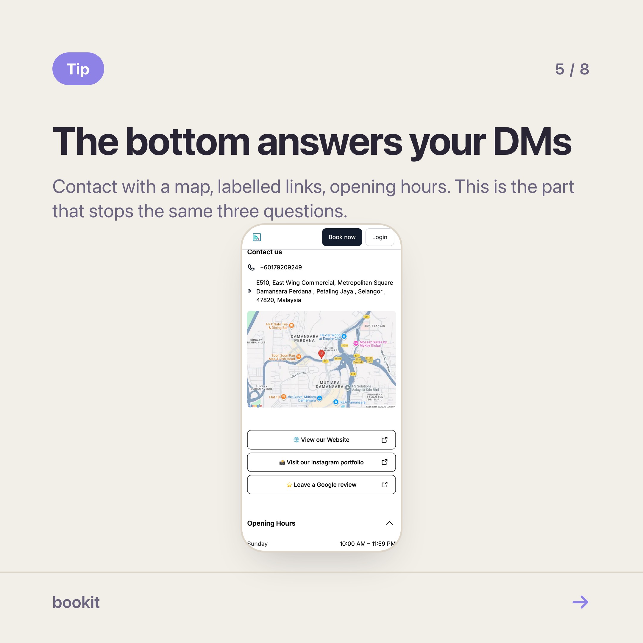
- 📍 Contact us — phone, address, a map. Tap-to-call, tap-for-directions
- 🔗 Links — a list of labelled links. This is the section that replaces your link-in-bio tool
The ones worth adding when you have something to say:
- 📣 Promotional message — one line. "Signature facial RM88 this month". Change it and forget it
- 🎁 Promotional section — a richer promo block with an image, for the offer you want seen before the price list
- ✍️ About us — rich text: your story, your approach. Write it once, in your own voice
- 📱 Social media icons — Instagram, TikTok, Facebook. Can be added more than once
- 📄 Rich text — a free text block you can add several times. Parking instructions, a policy note
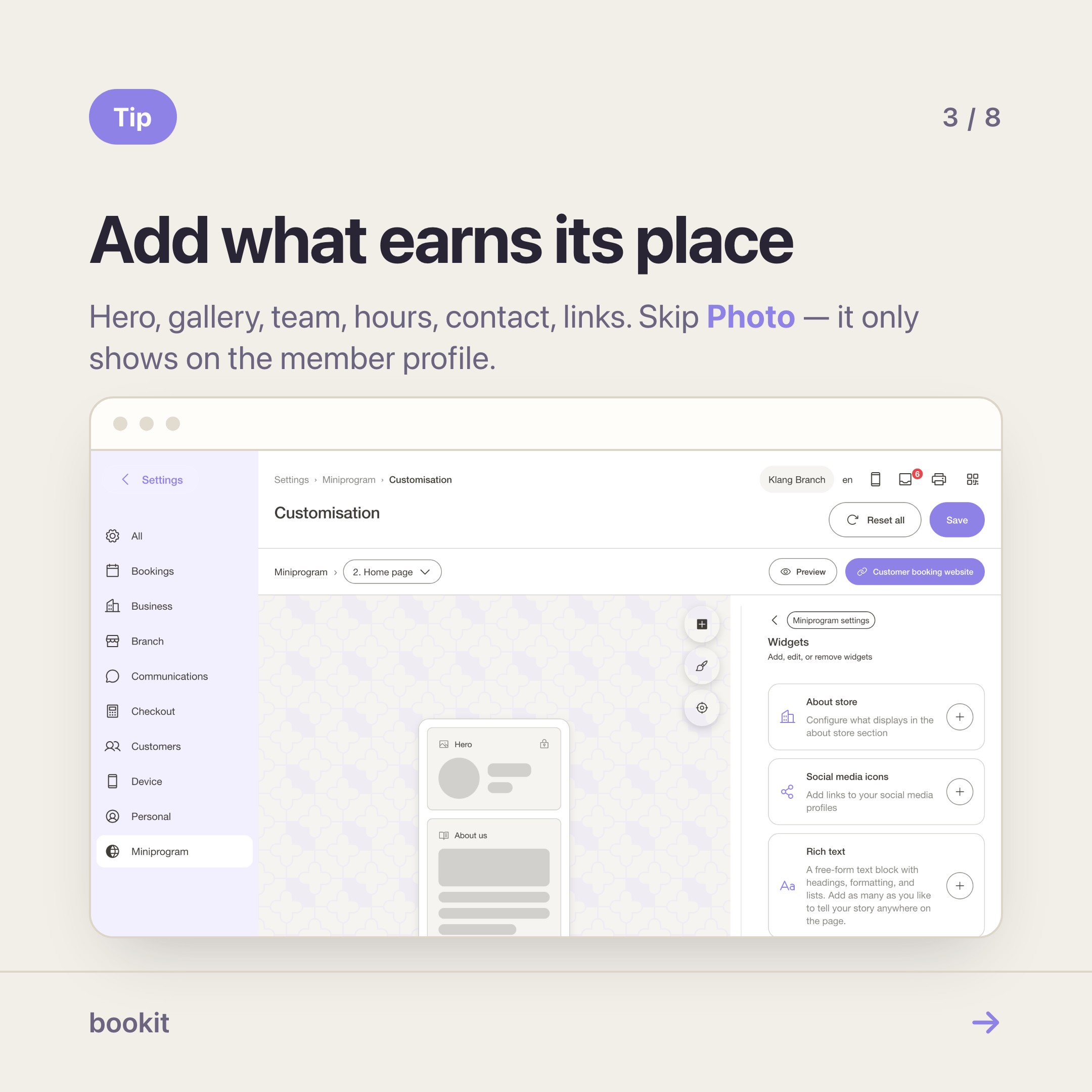
Three that will waste your time: Photo only renders on the member profile page, and About store and Appreciation message do not appear anywhere yet. Adding them breaks nothing; your customers simply will not see them.
The order that works
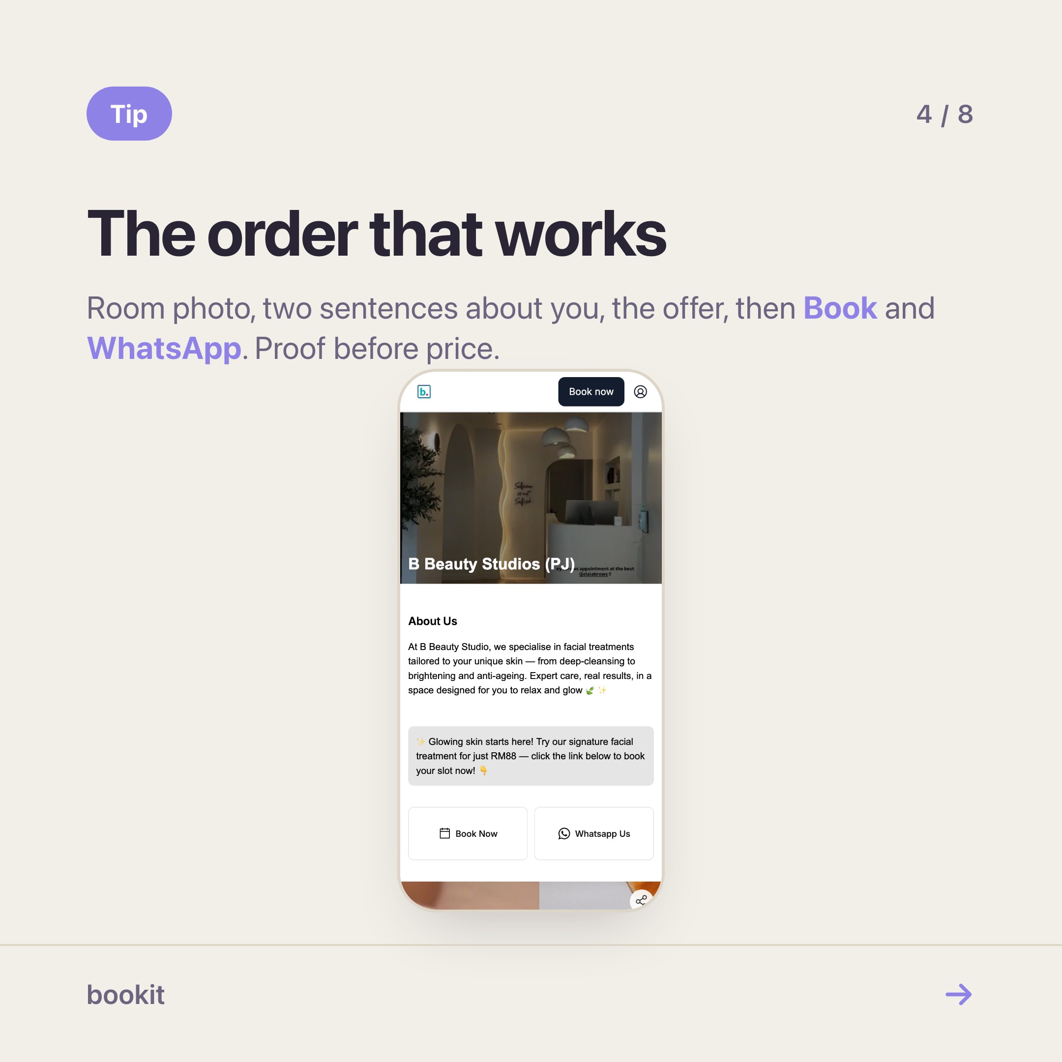
Most appointment businesses land on the same shape, and it is not an accident:
- Hero — one strong photo of the room, not a logo on a white square
- About us — two sentences, in your voice, so a stranger knows what they are buying
- Promotional message — only when something is actually on
- Quick access — Book and WhatsApp. Two tiles, not eight
- Gallery or carousel — your actual work
- Team — faces sell appointments, especially for hair, lash and brow
- Contact us, then Links and Social media icons
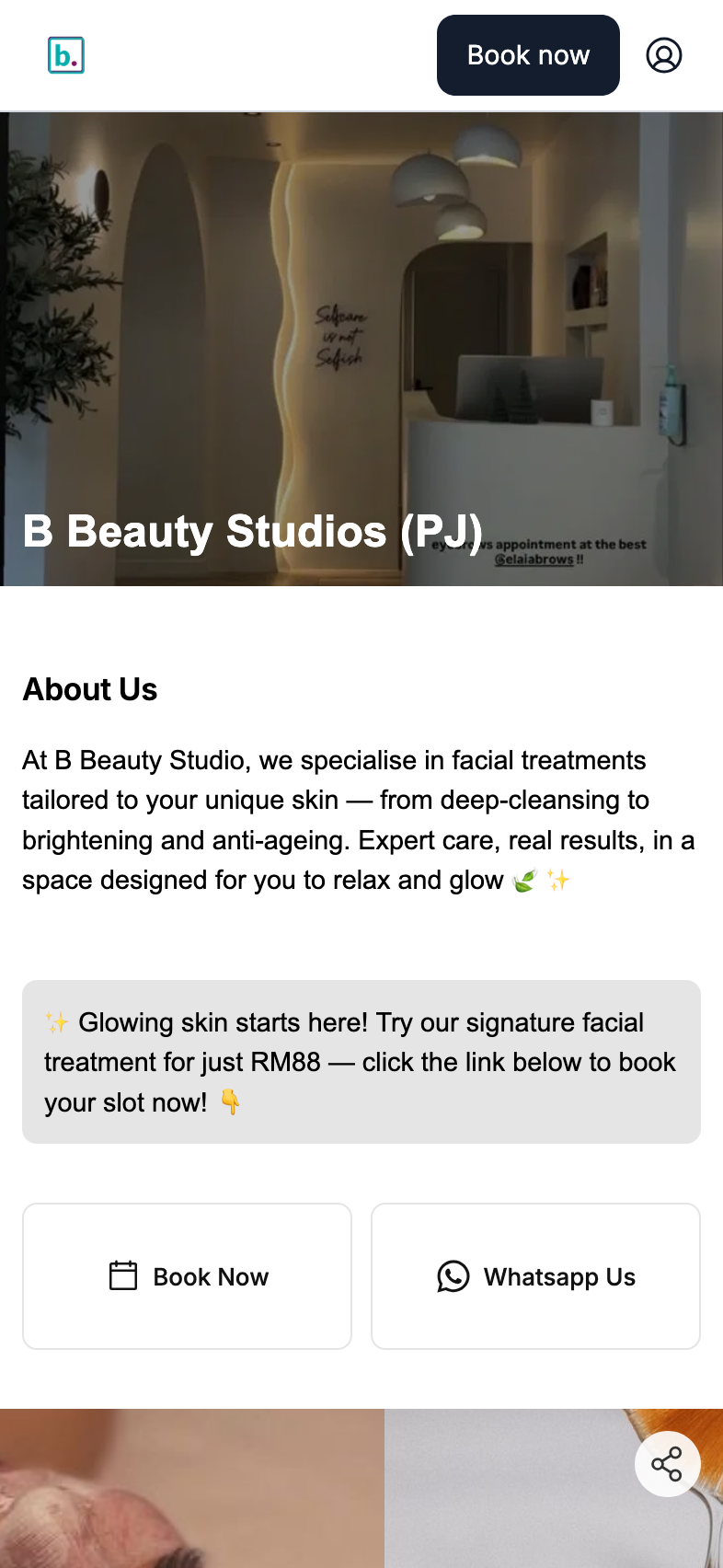
The principle: strangers buy proof before they buy a time slot, and regulars are hunting for the Book button in the position they already know. Proof above the price list, booking shortcut in the first screenful.
One order, two layouts
On a phone your page is one column, top to bottom, in exactly the order you dragged.
On a laptop or tablet the same sections fold into two columns by themselves. The narrow left rail takes the fixed, factual blocks — hero, opening hours, contact, social icons, links. The wide right column takes what people scroll through — carousel, promotional blocks, about us, gallery, team.
Which column a section lands in is fixed. You are arranging one order, not two layouts, and the device toggle in the editor is there so you can check the fold — not so you can lay the page out twice.
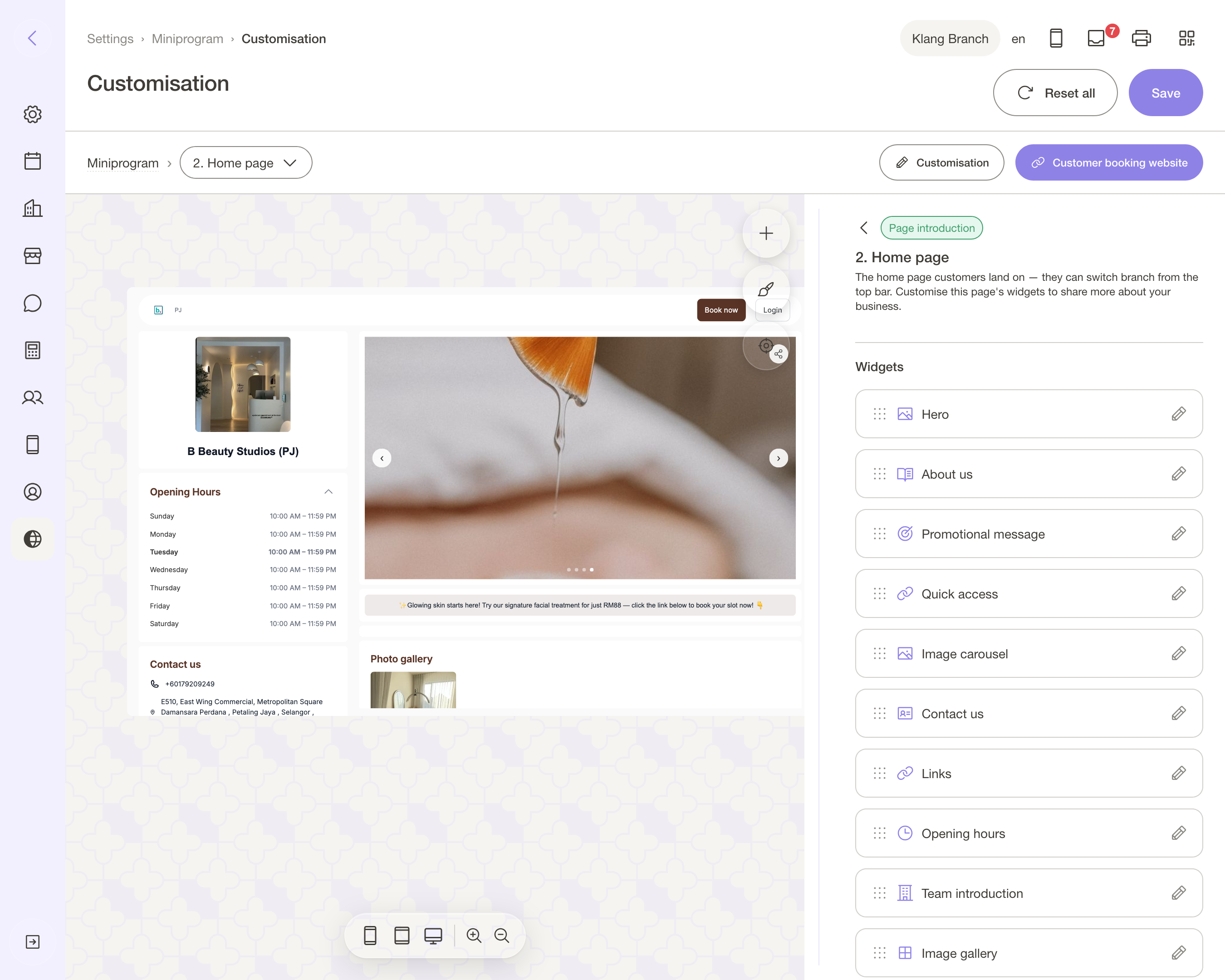
Most of your customers are on a phone. Arrange for the phone, then check the fold.
The bottom of the page is doing more work than you think
Contact, links and opening hours look like housekeeping. They are the reason someone stops asking you things in DMs.
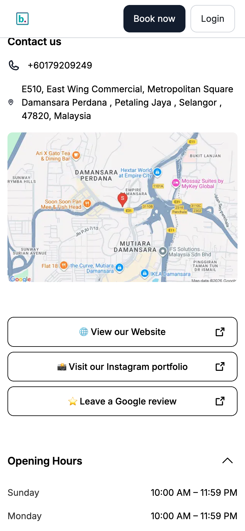
Two things to copy from that page:
- Label links by destination, not by name. "Visit our Instagram portfolio" beats "Instagram".
- One emoji per label reads as an icon on a phone — 🌐 for the website, 📸 for the portfolio, ⭐ for the review link. One. A row of them reads as a sale banner.
If your bio link currently points at a link tool that points at your booking page, this section is how you collapse that stack.
Colours come after photos
Most pages that look cheap do not have a colour problem, they have a photo problem. Fix the photos first:
- 📸 Branch image — Settings → Branches → your branch → General. The room, lit, tidy, shot at eye level
- 🔲 Business logo — Settings → Business. A square version with room around it
- 🖼️ Hero, carousel, gallery — in the editor. 1200 × 800 px or larger, JPG, PNG or WebP, up to 5MB each
Rules that hold up: your own work rather than stock, the same crop and the same light across a set, and team photos taken against one wall on one day.
Then colours. Appearance holds three cards — Theme (primary and secondary), Text (heading, subtitle, body) and Buttons (background and text). Take them from your shop rather than a palette generator, and check the button still reads clearly once you have changed it.
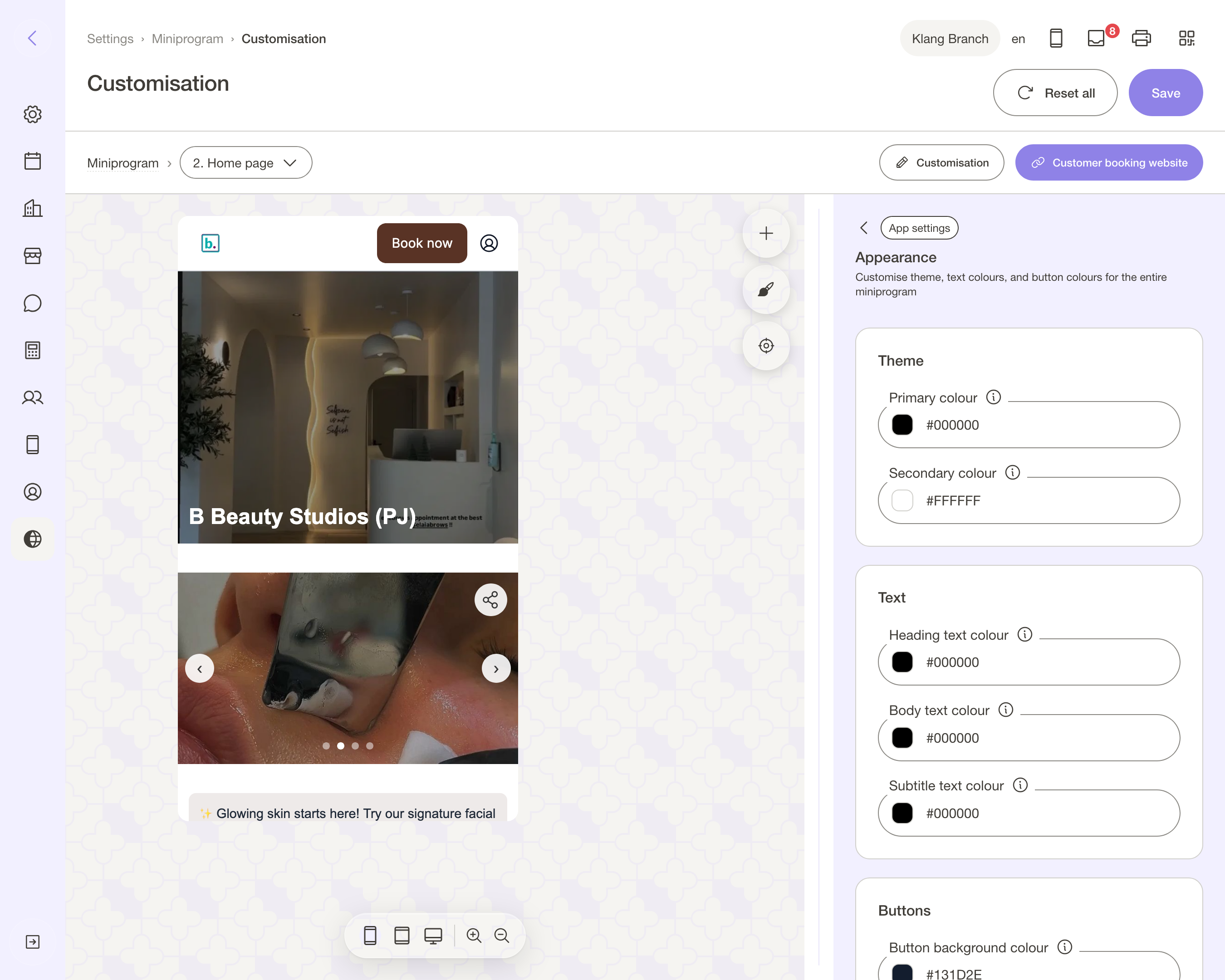
The booking steps are a setting, not a section
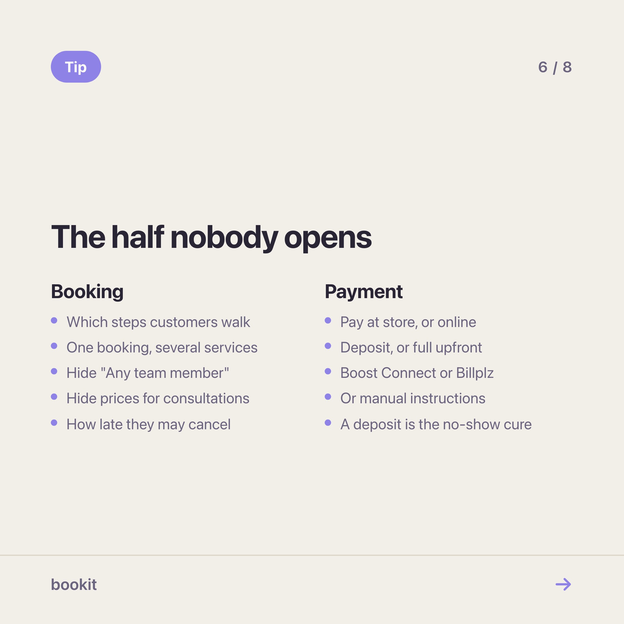
Arranging blocks is the visible half. The half that decides whether a booking actually completes lives one level up, in Settings → Miniprogram, and most merchants never open it.
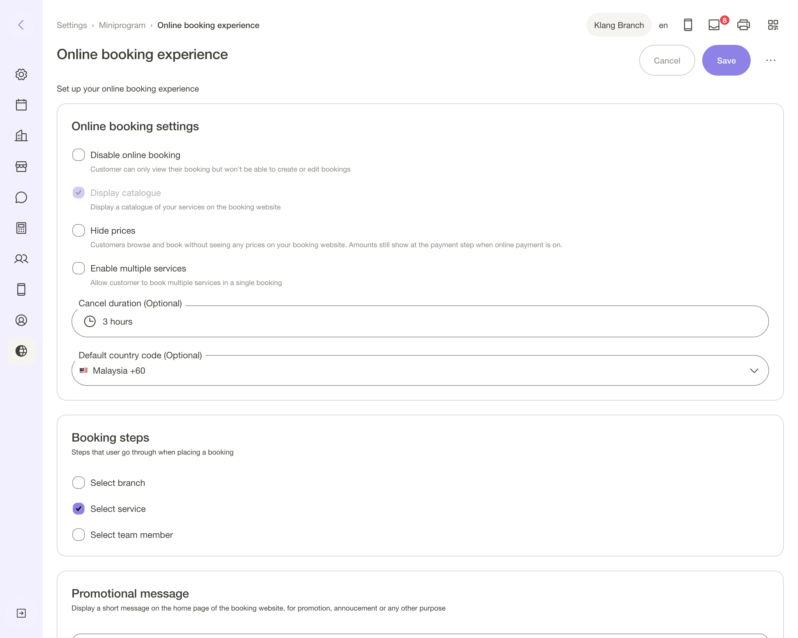
Booking experience holds the shape of the flow:
- Booking steps — which steps a customer walks through: branch, service, team member
- Hide "Any team member" — force a real choice instead of letting bookit auto-assign
- Enable multiple services — one booking, several services, for the customer who wants a facial and a manicure
- Display catalogue — show your full service list on the page, prices and all
- Hide prices — browse and book without seeing a price, for consultation-first businesses
- Cancel duration — how late a customer may cancel their own booking
- Disable online booking — the switch for "we are full, look but do not book"
Booking form decides what you ask for. Which customer fields appear, which are required, what order they sit in, and any custom fields of your own — the allergy question, the referral source, the car plate for your valet.
Ask for less than you think. Every extra required field is a booking that does not finish at 11pm.
Booking policy and the Data & privacy notice are the terms a customer agrees to before confirming. Write them once.
Then decide how they pay
Settings → Miniprogram → Payment is where a booking turns into money, and it is two decisions.
First: what the customer does at the end of the booking.
- 🏪 Pay at store — nothing is collected online. Everything is settled at your counter
- 💧 Online deposit — a part payment holds the slot. The rest is paid in store
- 💳 Online full upfront — the whole amount, before the slot is confirmed
A deposit is the single best no-show cure there is, and it does not have to be large. The point is not the money; it is that somebody who has paid RM30 turns up.
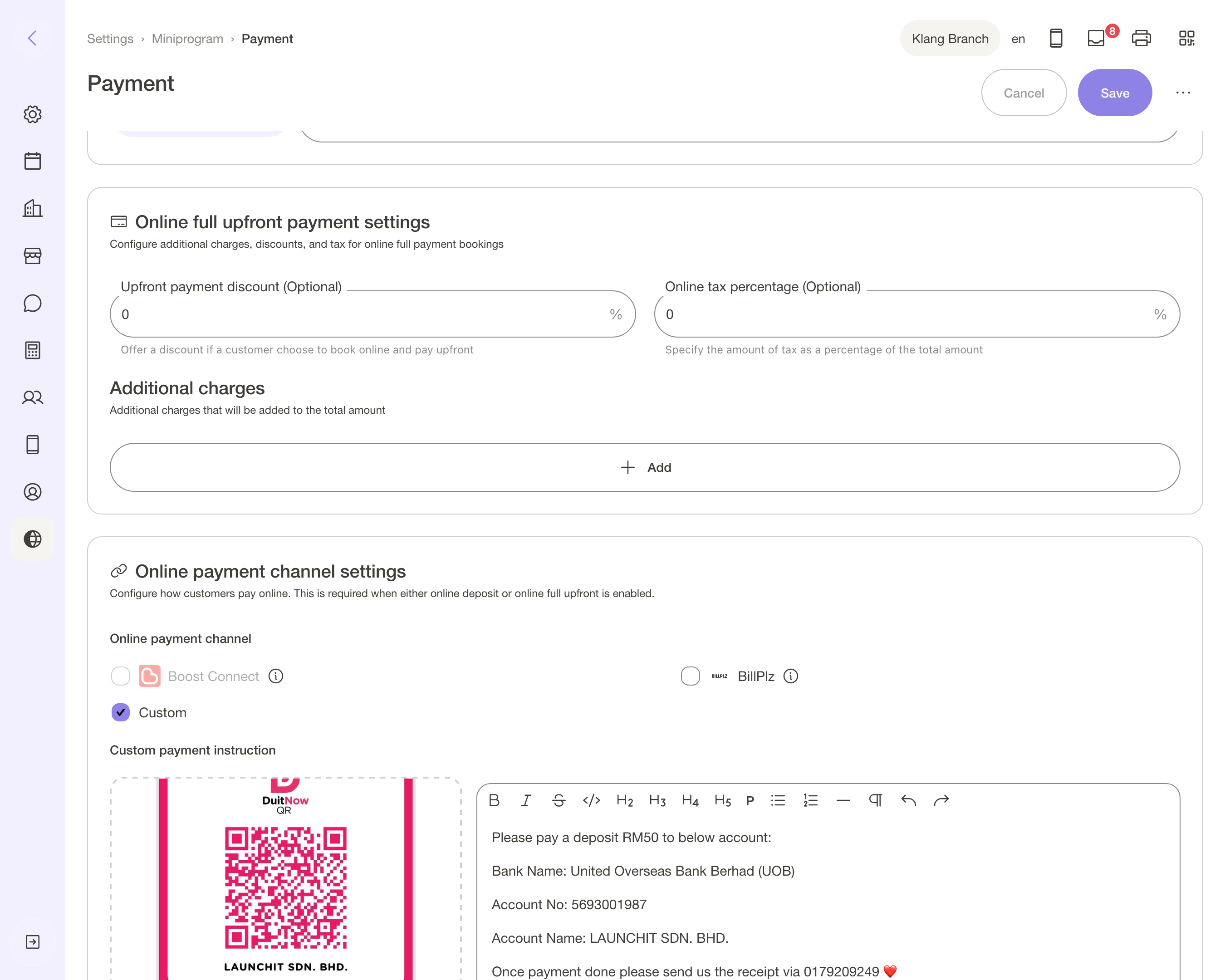
Second: which channel takes the money. You bring the gateway; bookit routes the booking through it.
🅱️ Boost Connect — our integration partner. One page taking FPX, cards and the major e-wallets, settling into your own bank account. You need: an application to Boost with your SSM registration and a business bank account, then the Client ID and secret pasted into Settings → Business → Integrations. Approval takes about a week, and we switch the channel on per business while it rolls out.
💠 Billplz — your own Billplz account, if you already have one. You need: your API key and collection ID, in the same Integrations page.
🧾 Custom — manual instructions: your bank details or a DuitNow QR shown to the customer, then you confirm the payment yourself. You need: nothing. It is the no-gateway option, and it still beats "pay at store" for holding a slot.
One thing worth knowing if you use Hide prices: amounts still appear at the payment step when online payment is on. Hiding prices while charging online is a contradiction the page will not pretend away.
More on how money moves through bookit is on the payments page.
What to keep in mind
Saving is live. No publish step, no staging.
The preview lags on images. Carousel and gallery show what you last saved, so save and reload when you are checking a change. Your live page is correct either way.
Team is per branch. A branch with nobody assigned shows no team at all.
It is a booking page, not a website. No blog, no separate domain, no landing page per campaign. If you publish treatment explainers, keep a brochure site and point it here.
Read next
- Make your booking page look like your shop — what changed when the editor went out to everyone
- Stop paying for Linktree — collapsing the bio-link stack into this page
- Set up Miniprogram Pro — the paid half: customer login, package balances, the wallet member card
- Miniprogram or Miniprogram Pro? — the one question that decides whether you need the add-on