You have added Miniprogram Pro to your subscription. Nothing new to install, nothing to publish — the customer login is already live on your booking page.
What changes is what you can edit. Two pages that carried a padlock before are now yours, and there is a member card waiting to be designed. That is the whole job, and it takes about twenty minutes.
This article is only the Pro half. The free half — the thirteen sections on your home page, the order they belong in, the colours — is a separate guide, and it is worth doing first if you have not.
Where Pro shows up
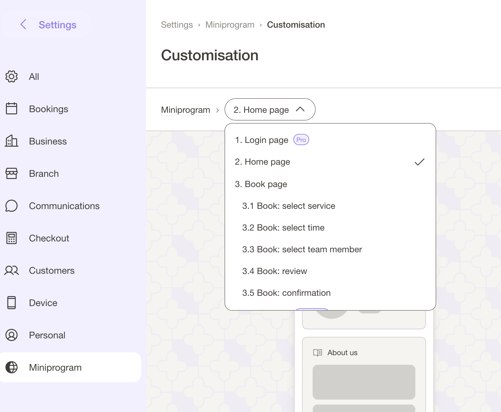
It is the same place as everything else: Settings → Miniprogram → Customisation → Customise. There is no separate Pro screen.
What changed is the page selector at the top. Before Pro, Login page and Member profile page sat in that list with a Pro badge and a padlock — you could look at them, not edit them. With Pro on your subscription they behave like every other page: select, drag, configure, save.
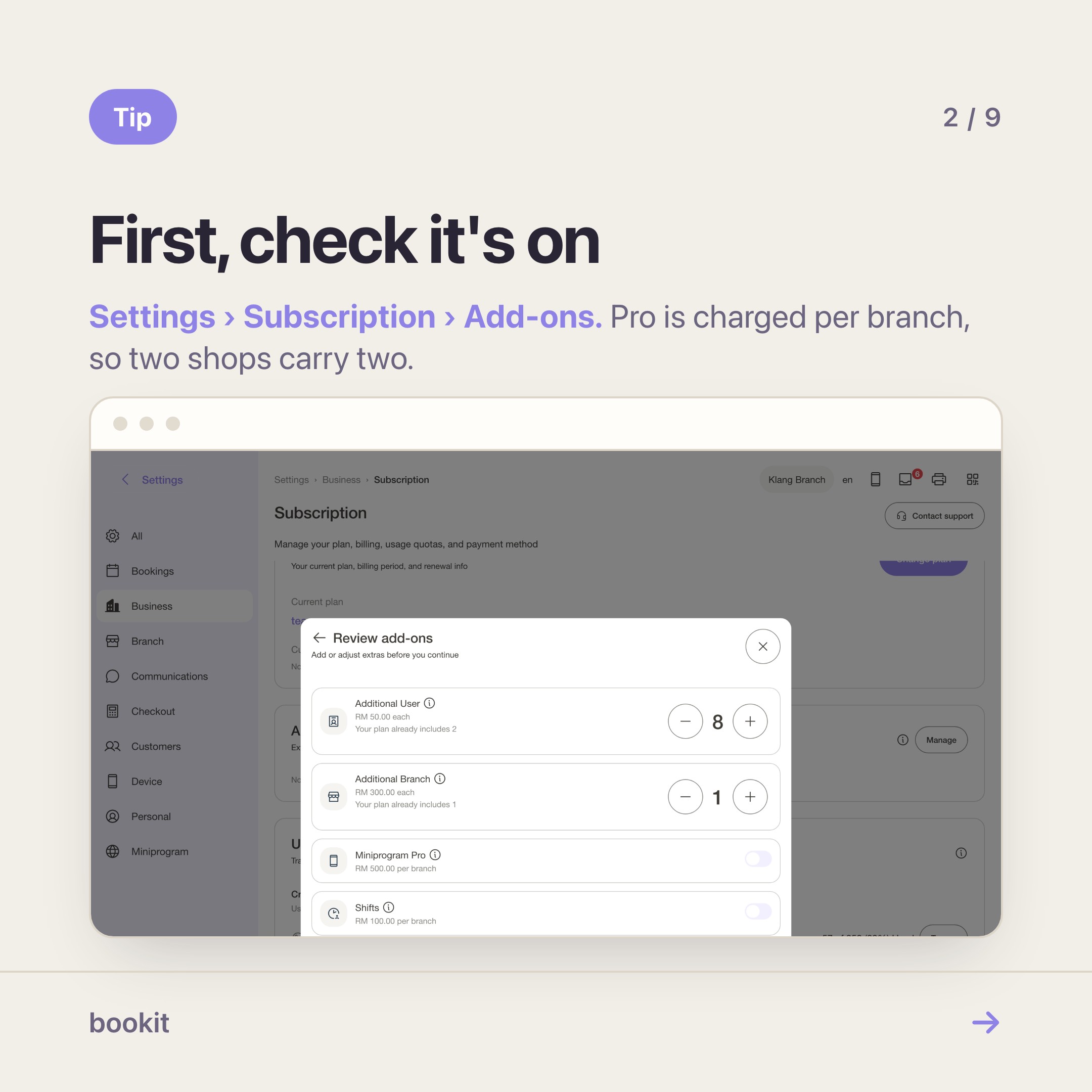
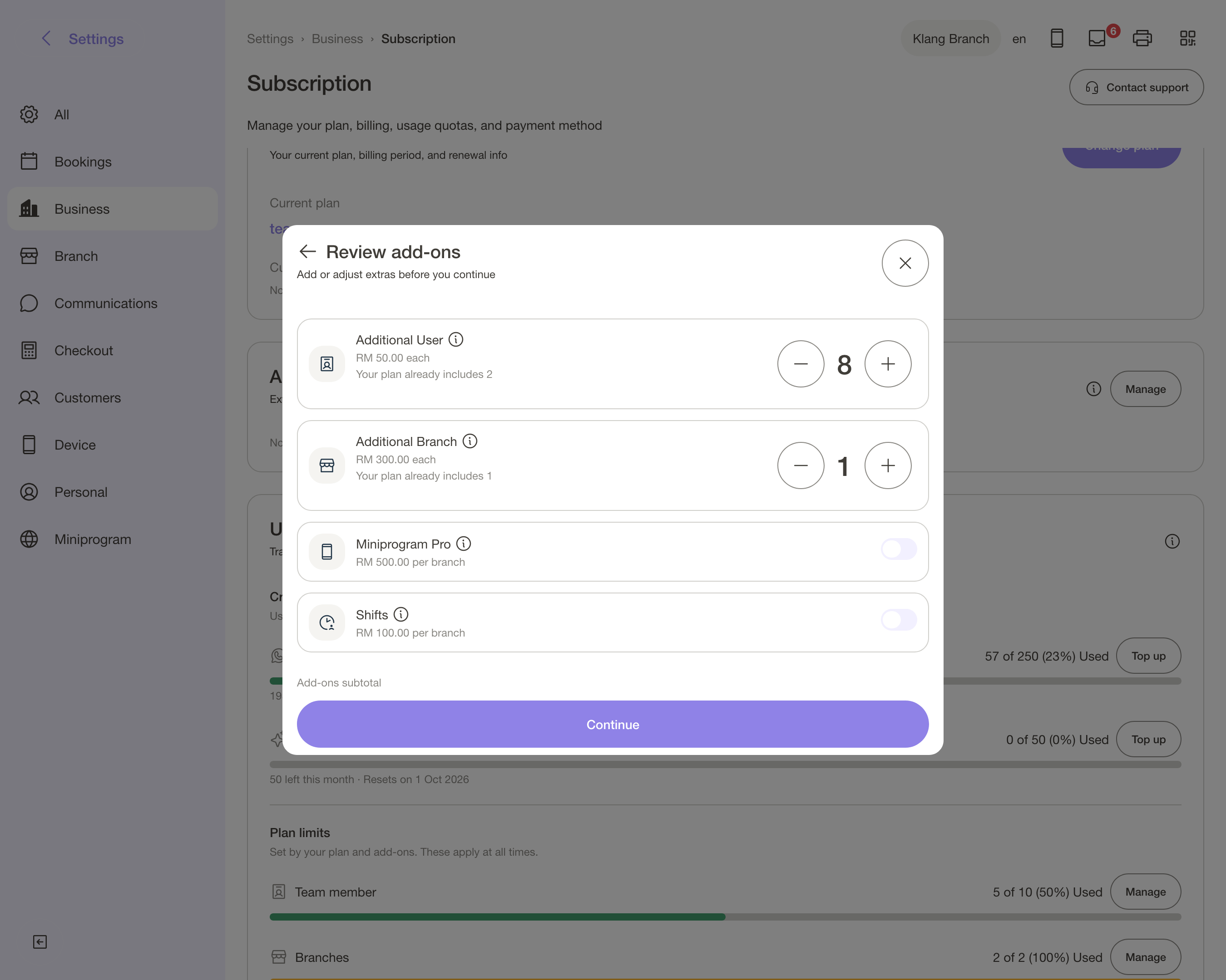
If they still look locked, check the add-on actually landed on your subscription: Settings → Subscription → Add-ons. Pro is priced per branch, so a two-shop business carries two lines.
What Pro actually unlocks
- 🔓 Login page — a sign-in screen you can brand: background, logo, heading
- 👤 Member profile page — seven sections of your customer's own account, ordered by you
- 🔖 Member QR — a code that identifies the customer at your counter
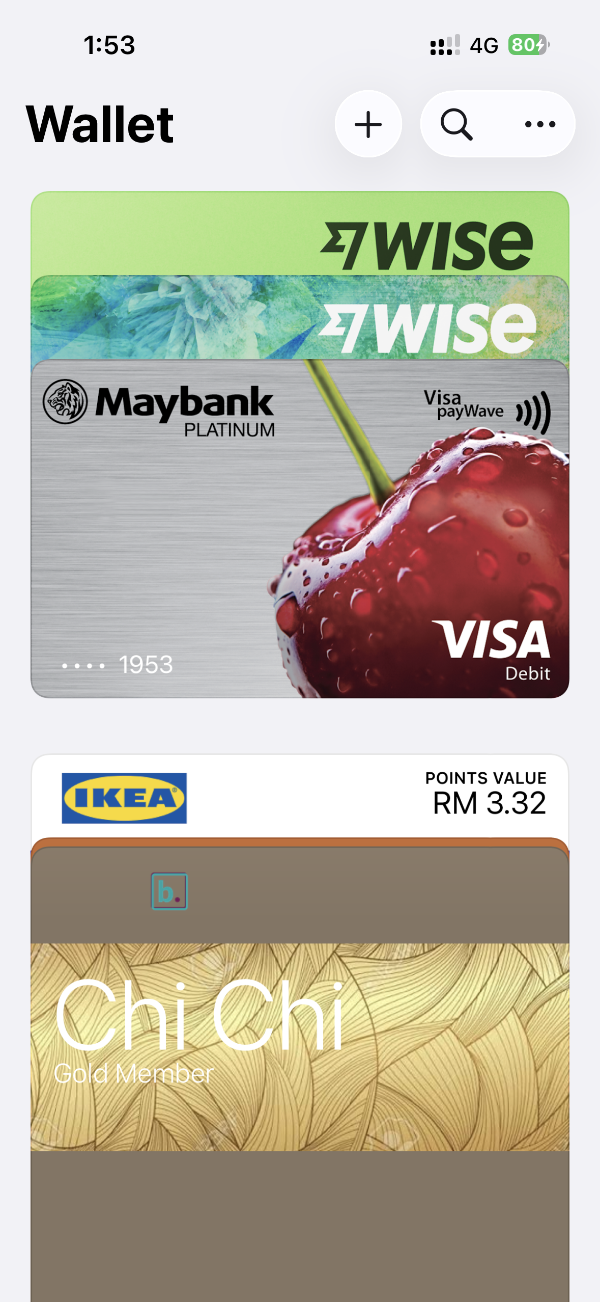
- 🎟️ Wallet pass — the same code as a card in Apple Wallet or Google Wallet
- 🔒 Public notes — the visit notes you choose to share with the customer
- 📊 Tracking scripts — your own Meta Pixel and Google Tag on the storefront
And one thing it changes whether you like it or not: your booking page now opens on a sign-in screen. Regulars pass it once and stay signed in. A first-timer meets one extra step. If most of your bookings come from strangers rather than regulars, read the trade-off properly before you tell everyone.
1. Your front door
Customers meet this screen before anything else, so give it five minutes.
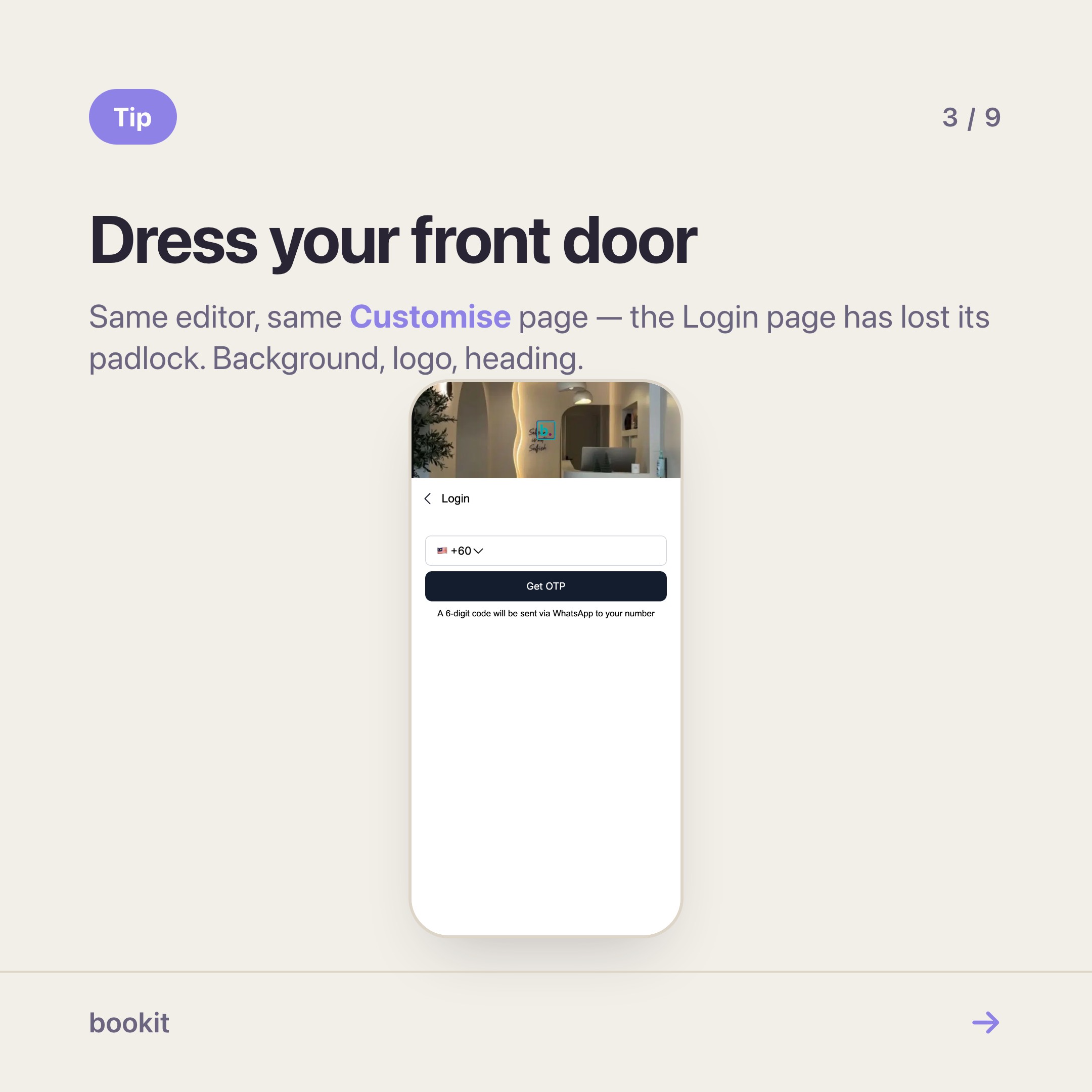
Select Login page, then open its settings:
- Background image — full-bleed. The room, not a stock photo
- Logo — none, your business logo, or an upload
- Heading — rich text, starting from your business name. "Sign in to B Beauty Studios" beats a bare name
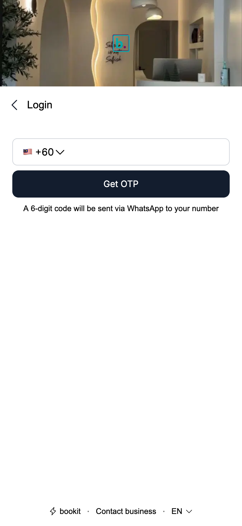
The form itself you do not touch, and it is deliberately short: a phone number and a one-time code, sent on WhatsApp first and SMS if that fails. No password, nothing to install. One account covers every branch of your business, and it does not carry across to other businesses on bookit.
2. The page you actually paid for
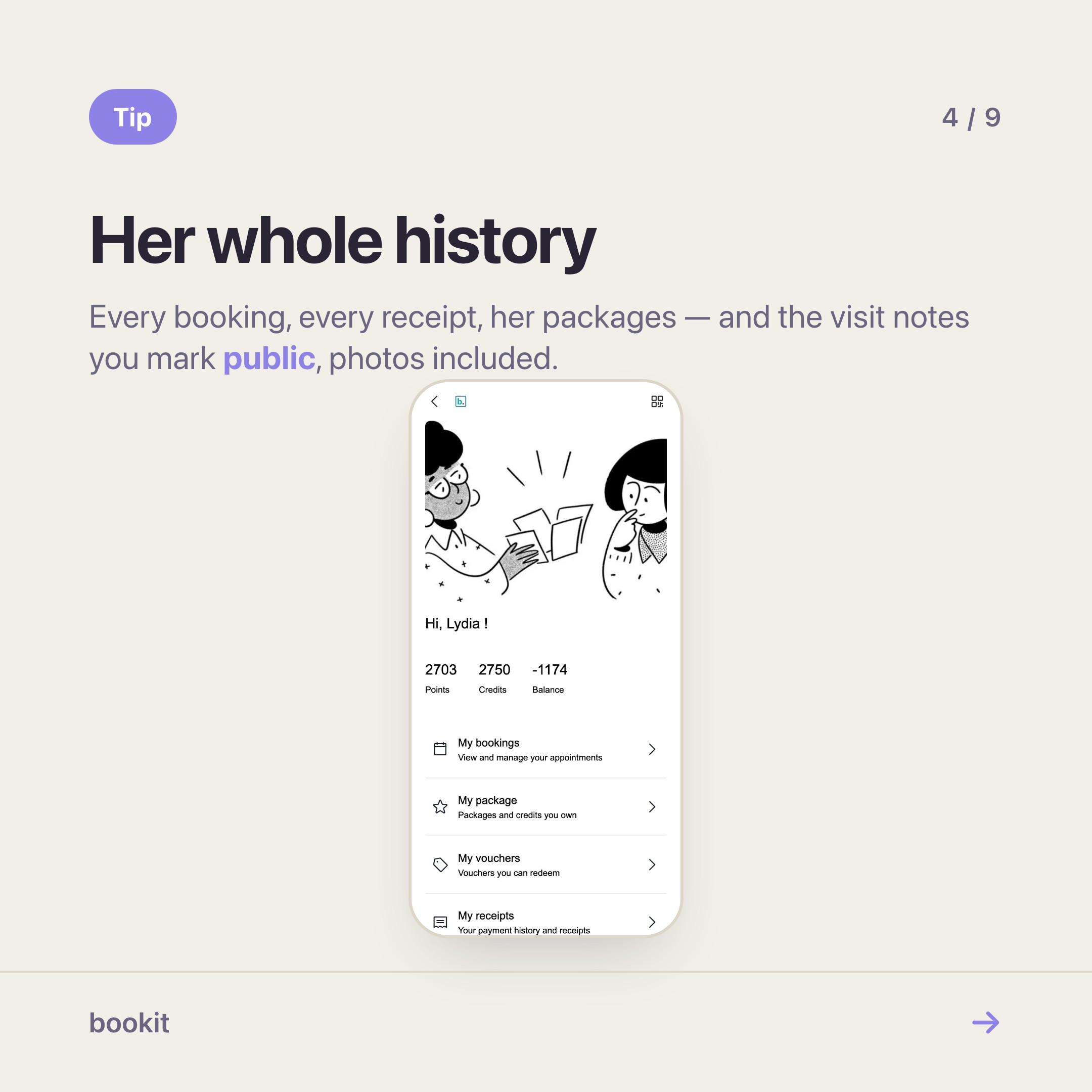
Select Member profile page. Seven sections, ordered the same way as any other page:
- ⭐ Membership details — their standing with you, at a glance
- 📅 My bookings — every appointment, upcoming and past
- 🎫 My packages — sessions bought, sessions left
- 🎁 My vouchers — what they can still redeem
- 🧾 My receipts — their whole payment history with you
- 🖼️ My notes — the visit notes you have chosen to share, photos included
- ✏️ My details — name and phone, which they can correct themselves
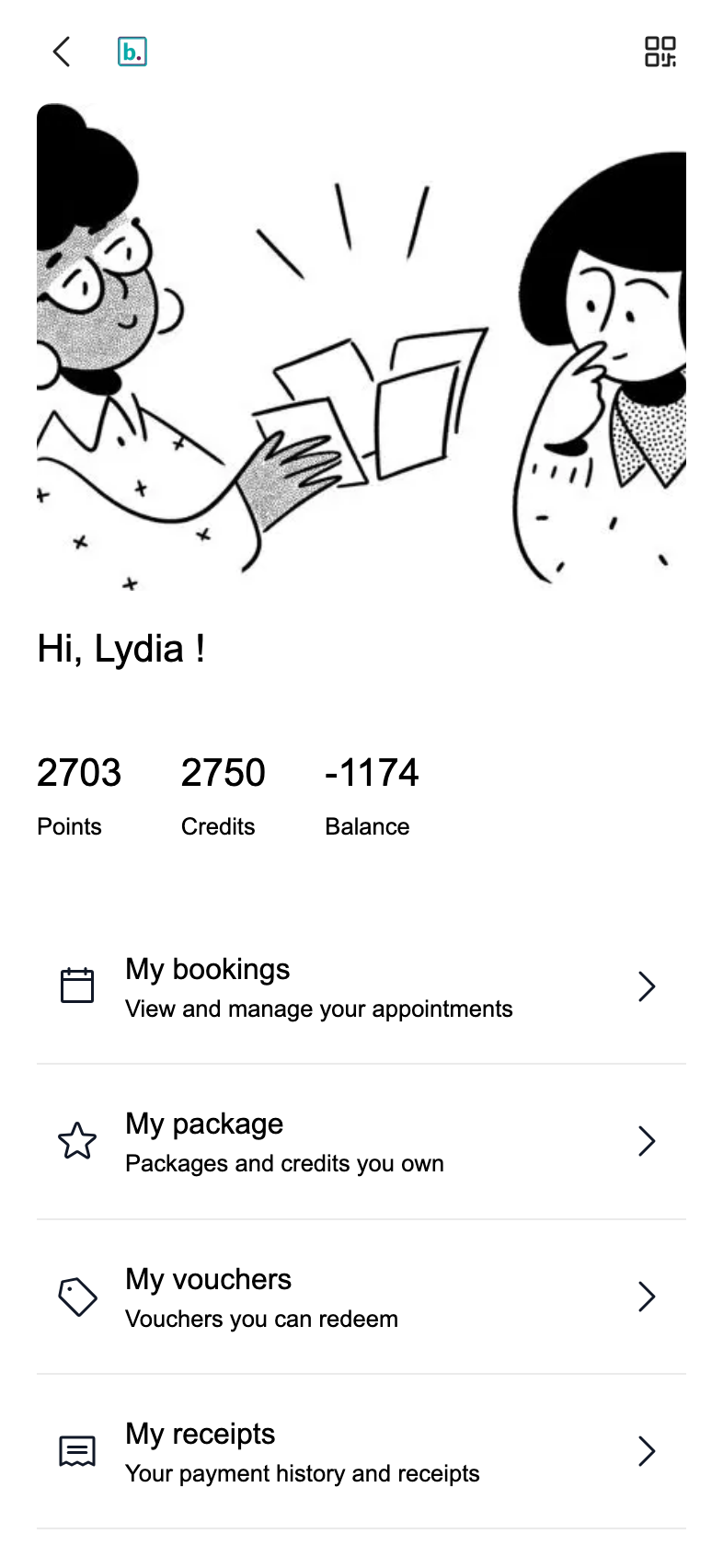
Make one change before you leave this page: drag My packages above My bookings.
That is the entire reason most merchants buy Pro. "How many sessions do I have left?" is the most-sent message in the beauty business, and it is only answered by the customer if the number is the first thing she sees.
Bury it under bookings and you will keep answering it yourself at 10.40pm. There is a whole article on what that question costs.
What she can look back at
This is the part merchants underestimate, so it is worth being specific about what "her own account" actually holds.
📅 Every booking, not just the next one. Upcoming and past, with the service and the date. The customer who wants to book "the same as last time" can go and read what last time was, instead of describing it to you over WhatsApp.
🧾 Every payment she has made with you. Receipts she can open again months later — for her own records, for a reimbursement, for the husband who asks what the RM380 was.
🖼️ The notes you choose to share — photos and all. This is the one worth setting up properly.
Most merchants already write visit notes: the formula used, the shade mixed, the depth, the aftercare. Plenty attach before-and-after photos to them, because a lash set or a colour correction is a record you want in six weeks when she asks for "the same but slightly warmer".
With Pro, each note carries a visibility: private, which is what every note is by default, or public, which puts it in her own profile with its photos. You choose per note. The shade formula and the before-and-after are public; "arrived 20 minutes late again" stays private, where it belongs.
What that does for a customer is give her a history she can scroll: what was done, when, by whom, what it looked like.
What it does for you is end the "can you send me the photo from last time?" message, and make the next booking easier to sell — she is looking at the result while she books it.
Why it is worth paying for
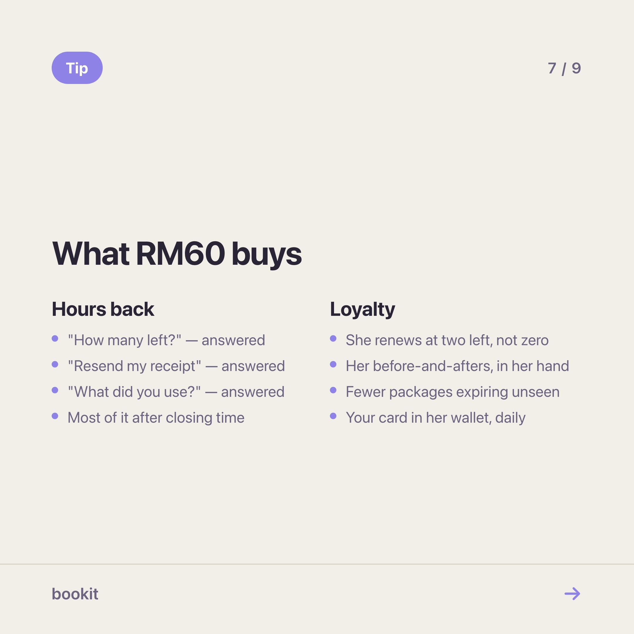
Pro is RM60 a month per branch. Two things pay for it, and only one of them is time.
⏱️ The hours. Count what you answered last month: how many sessions do I have left, is my voucher still valid, can you resend my receipt, what did you use on me last time, what time is my booking. Eighty active packages generates a few hundred of those a year, nearly all after closing. At two minutes each — and it is never two minutes, because you have to look each one up — that is a working week you did not bill for. The arithmetic in full.
❤️ The loyalty. This is the bigger half, and it is harder to see on a spreadsheet.
- A customer who can watch her balance fall renews at two sessions left, not at zero. A renewal at two is a continuation; a renewal at zero is a decision to start again, and that is where customers leave
- A customer who can scroll her own before-and-afters is holding the evidence that you are worth the price, in her own hand, at the moment she is deciding whether to rebook
- A package that lapses unnoticed is not a saving. It is a refund conversation, or a regular who quietly stops coming
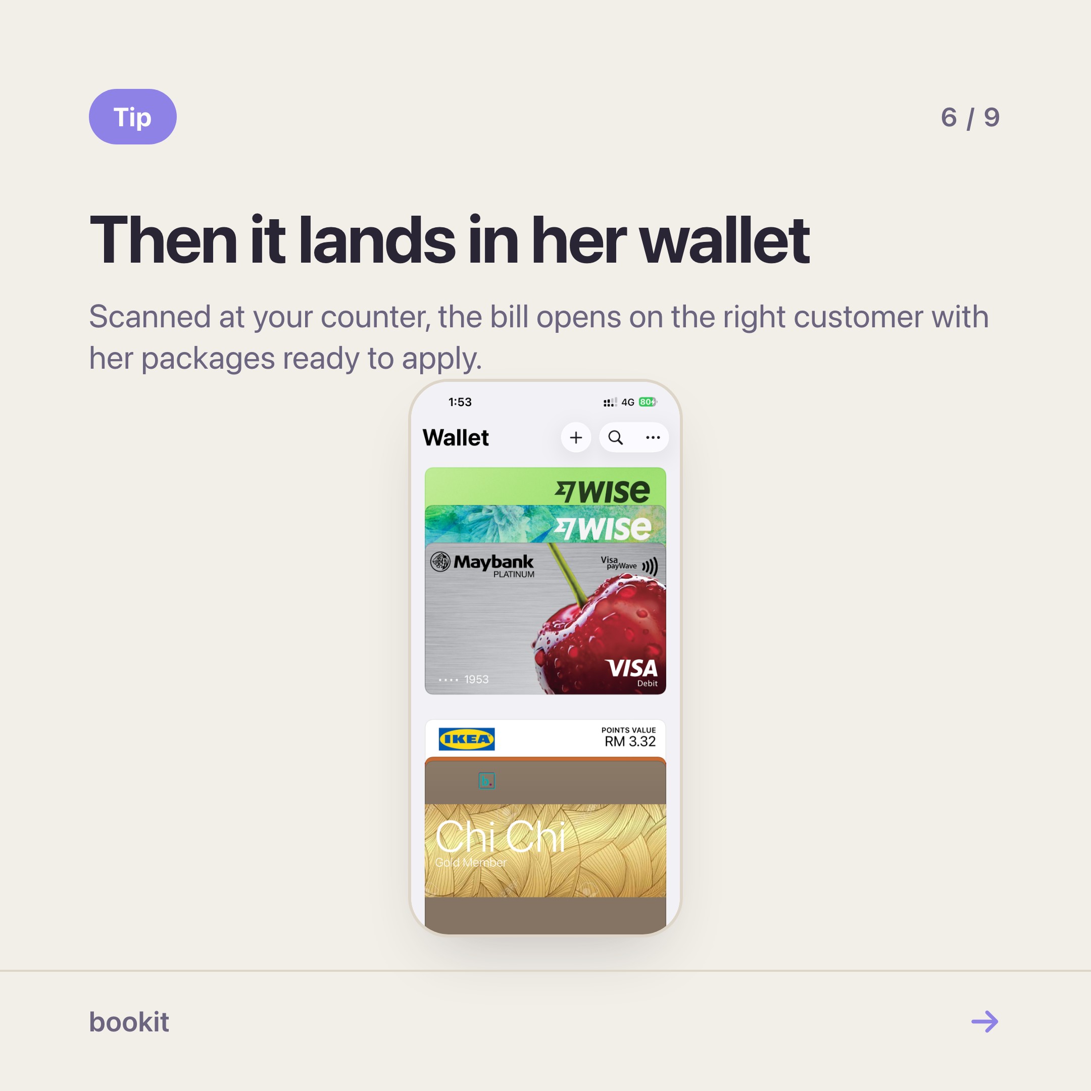
- A card in her wallet is your name between her boarding pass and her coffee card, every time she opens it
None of that shows up as "we saved two hours a month". It shows up as renewals happening earlier and packages not expiring — which is the number worth watching for the first three months after you switch it on.
3. The member card
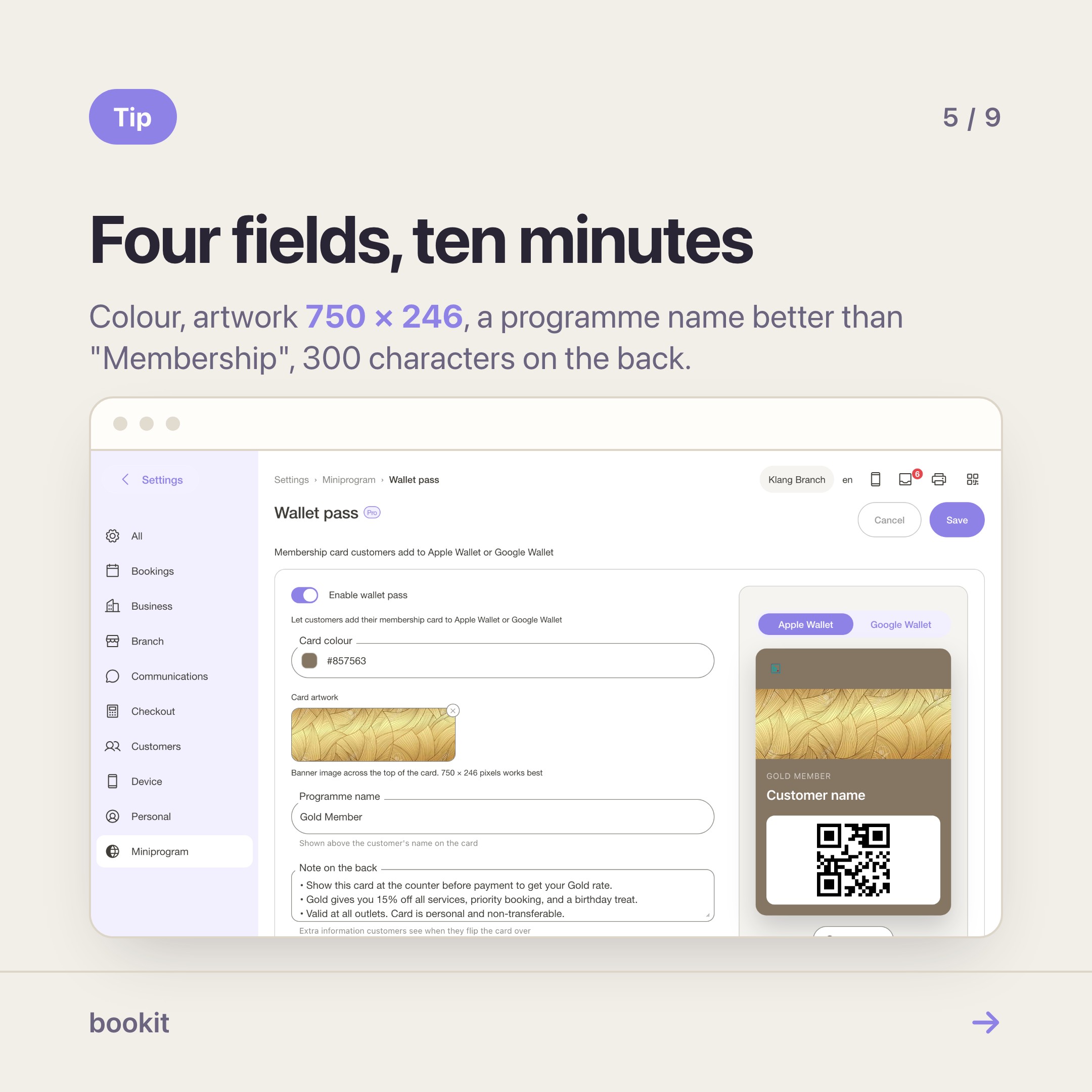
Back on the Customisation page, open Wallet pass and switch it on. Every signed-in customer can then save a card to Apple Wallet or Google Wallet.
Four fields:
- Card colour — the background. The text colour adjusts itself to stay readable, so pick the colour and stop worrying about contrast
- Card artwork — the banner across the top. 750 × 246 px works best
- Programme name — sits above the customer's name. Defaults to "Membership"; "B Beauty Members" is better
- Note on the back — up to 300 characters. Parking, your WhatsApp number, your cancellation window
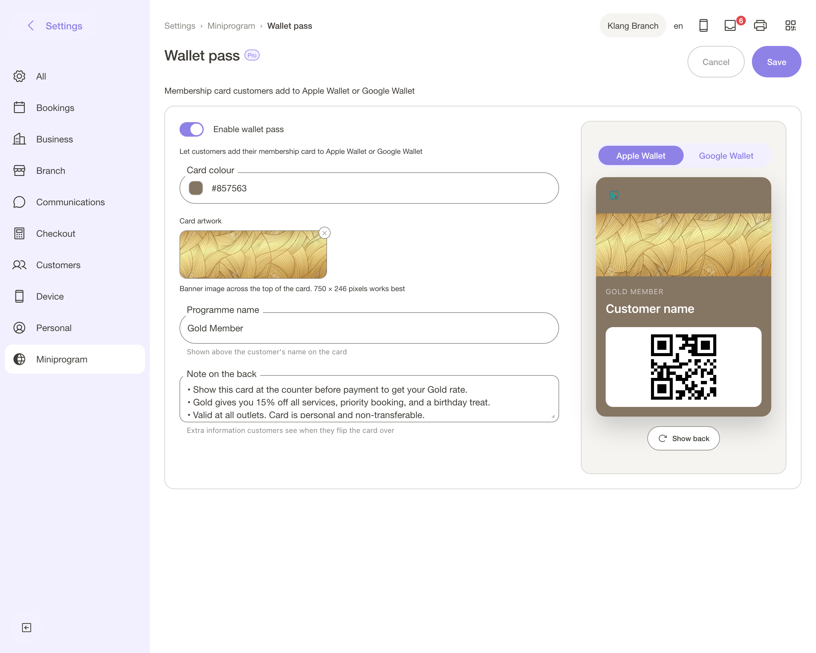
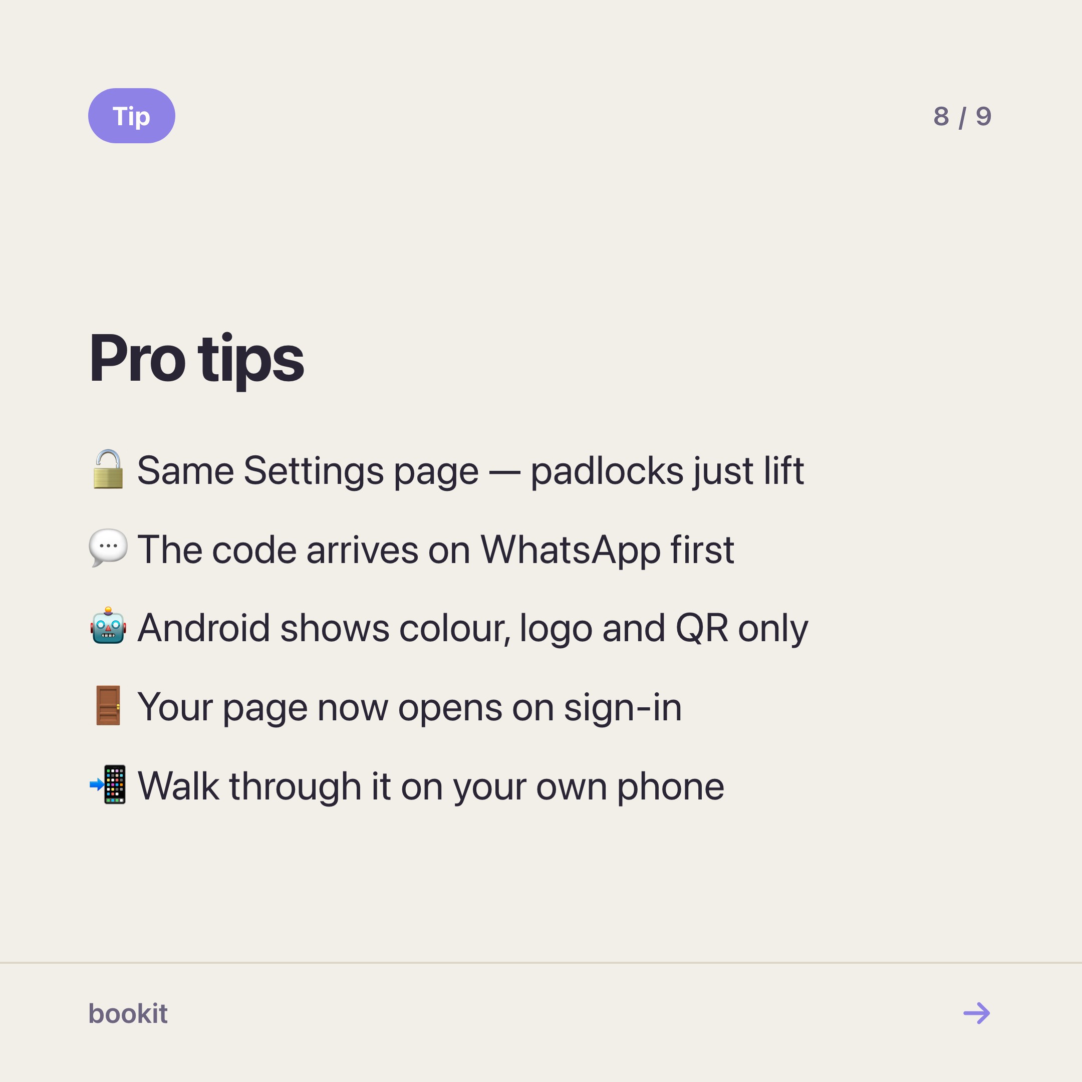
One thing before you spend an afternoon on the artwork: Android shows your colour, your logo and the QR code — the artwork band and the programme name are Apple Wallet only. Design for both, judge it on both.
The payoff is at the counter
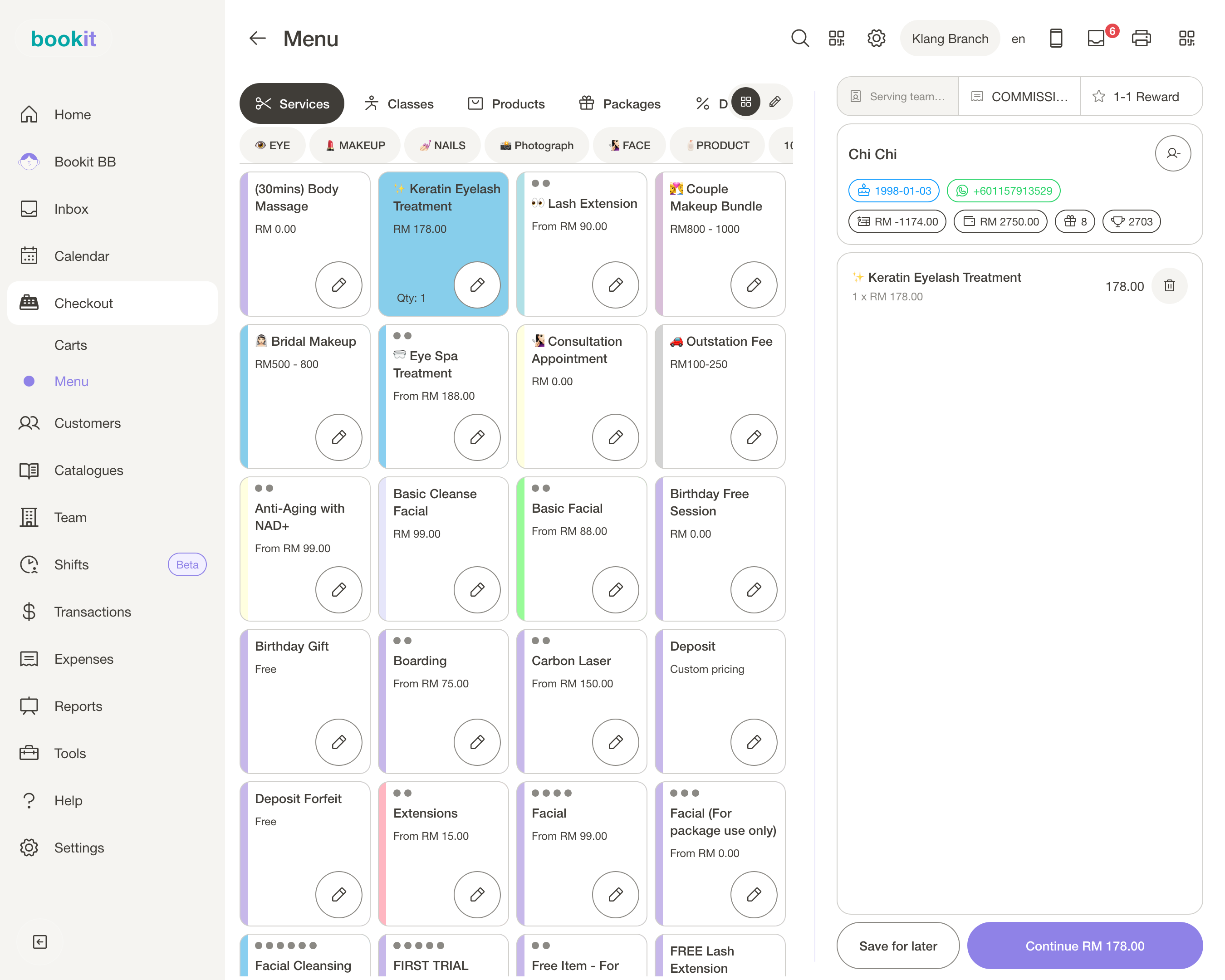
The card carries a QR that identifies the customer. Your team scans it at checkout and the bill opens on the right person, with her packages and vouchers ready to apply — no surname spelling, no "which Siti?", no scrolling the customer list while somebody waits.
The secondary payoff is that a card sitting between a boarding pass and a coffee loyalty card reminds people you exist, and it costs you nothing to sit there. More on that in running a members' club without building an app.
Twenty minutes, in order
- Check the add-on is on your subscription, and on the right number of branches
- Login page — background, logo, heading
- Member profile page — drag My packages to the top
- Wallet pass — colour, artwork, programme name, note on the back
- Save, then open your own booking page on your phone, signed out, with your own number
That last step is not optional. Walk through the sign-in, land on the profile, save the card to your own wallet. Ten minutes of that finds more than an hour of looking at the preview.
What to keep in mind
Saving is live. No publish step. What you save is what opens.
Your page now opens on sign-in. That is what Pro is. Tell your regulars at the counter — "save your card, it's in your wallet app" is a thirty-second conversation.
Pro is a billing entitlement, not a security wall. It decides what your subscription includes; it is not a vault for sensitive records.
Pro is per branch. Three shops is three times the price, and the quantity follows your branch count automatically.
Photo, About store and Appreciation message. Photo renders only on this profile page; the other two render nowhere yet.
Read next
- The booking page sections worth using — the free half, and the order that works
- Miniprogram or Miniprogram Pro? — the one question that decides it, and what Pro costs
- Turn your booking page into a member app — what your customers get out of it
- Run a members' club without building an app — the wallet card, in more depth