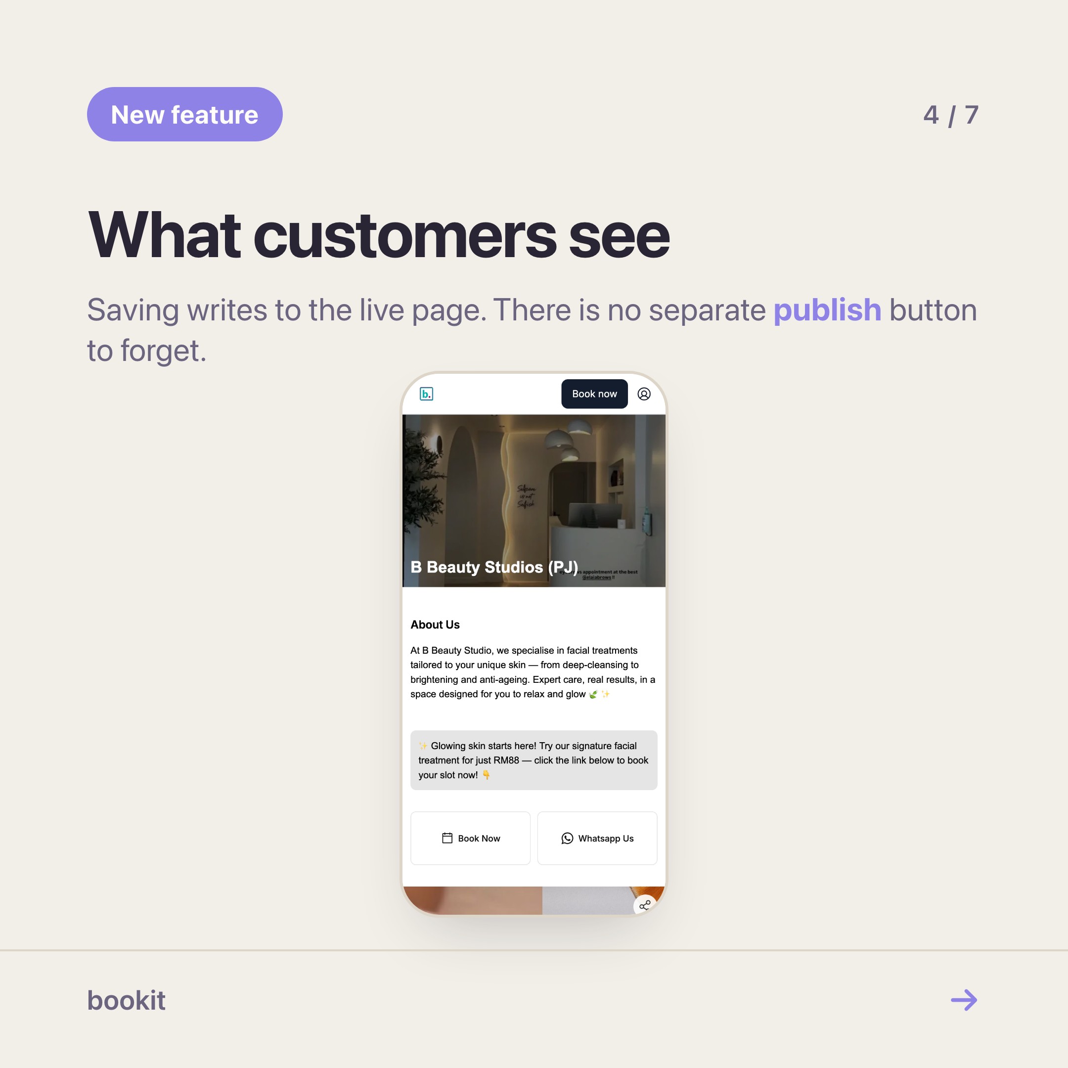
Open your own booking link on your phone, the way a customer would. Not the admin app — the link you paste into your Instagram bio.
For most shops, what loads is correct and completely anonymous. A name at the top, a list of services, a button. It works. It also looks exactly like the page of the studio two doors down, because until now every bookit booking page was arranged the same way.
That changed this week. The page editor is on for every bookit business, on every plan, at no extra cost.
What you can actually move
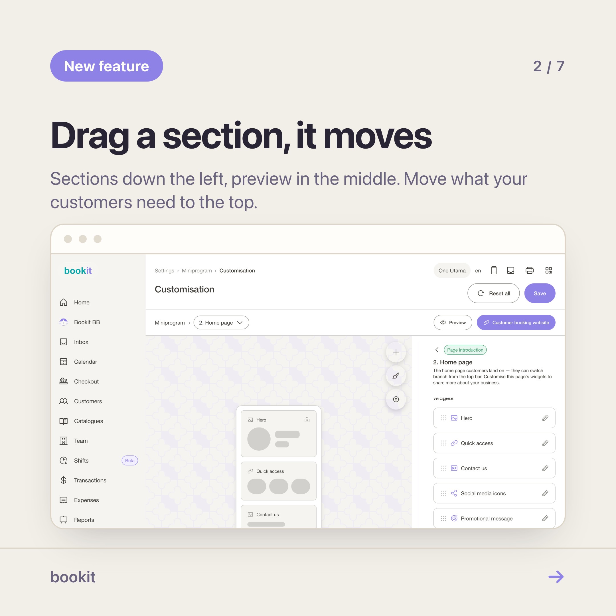
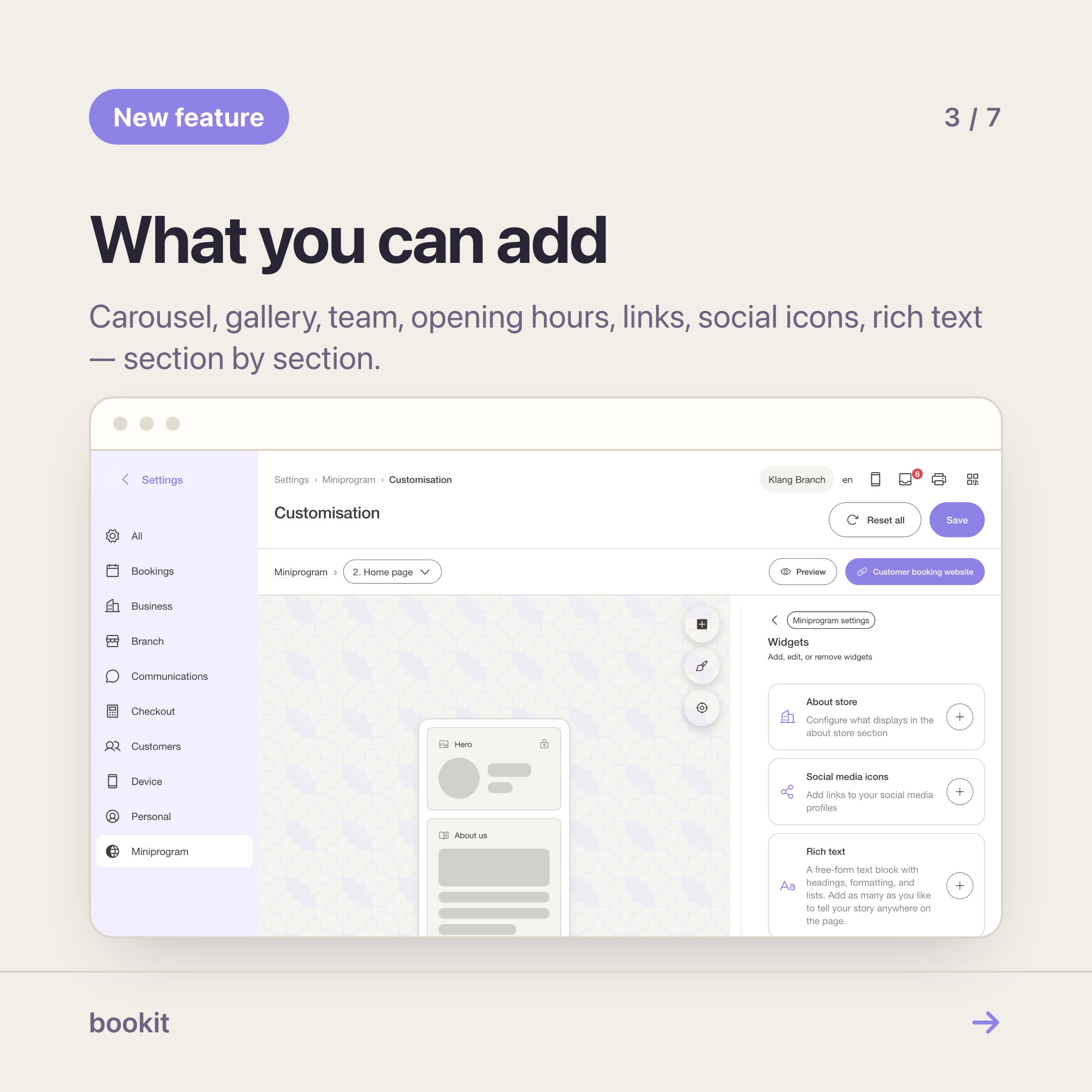
Your booking page is built out of sections. You choose which ones appear and what order they sit in, and each one has its own settings.
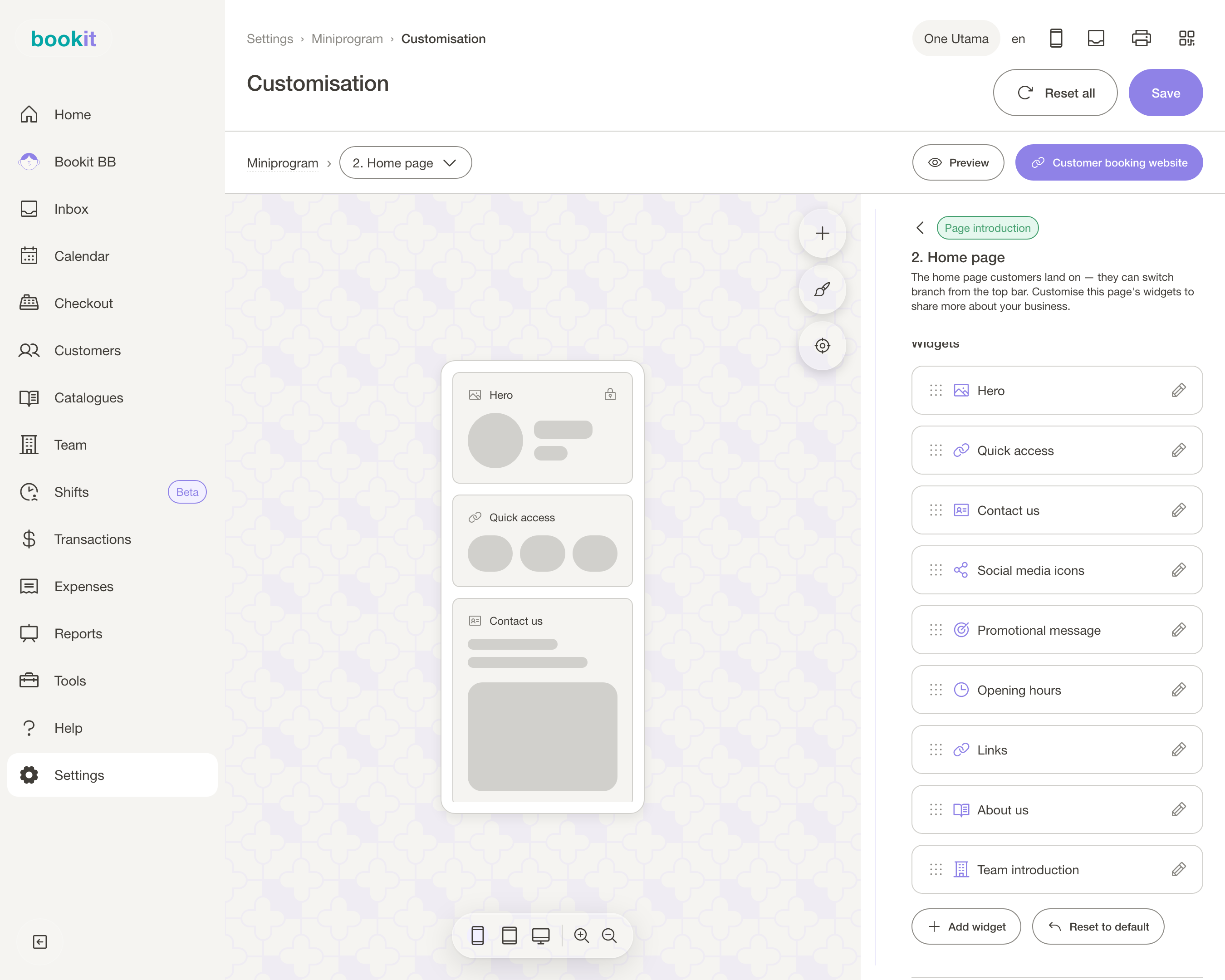
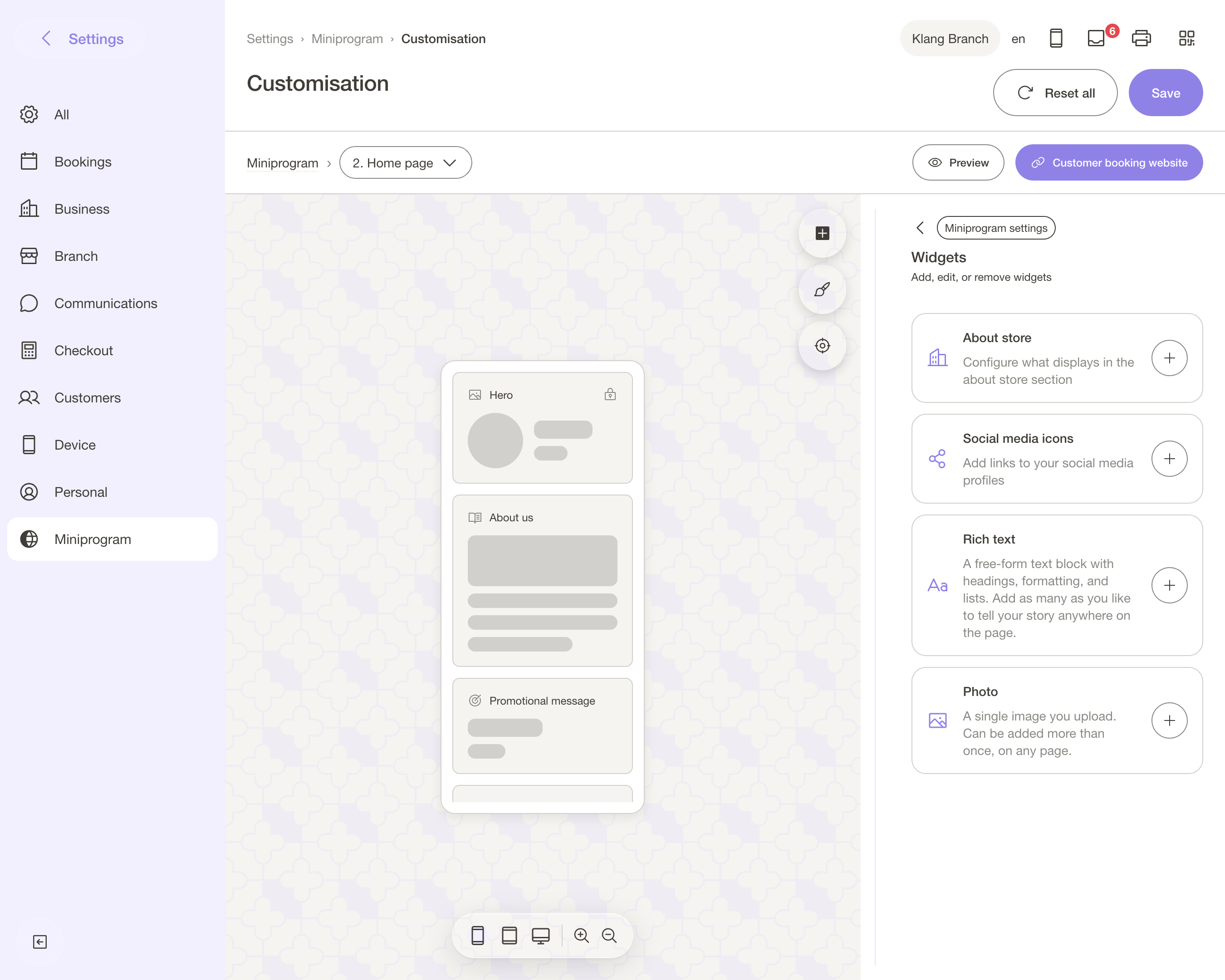
- Hero — your cover image, business name and the book button.
- Carousel and Gallery — your work. For a lash tech or a nail salon this is the whole pitch; put it above the service list, not below it.
- Promotional message and Promotional section — this month's offer, said once, at the top.
- Team — the people, with their photos and a line each. Customers who book a person, not a shop, book faster when the person has a face.
- Opening hours, Contact us, Social icons, Links — the bio-link job, on the same page as the booking.
- About us and Rich text — your own words, for the things a list of services never explains.
- Service list — the part that takes the money. It stays; you decide what sits above it.
Where it lives
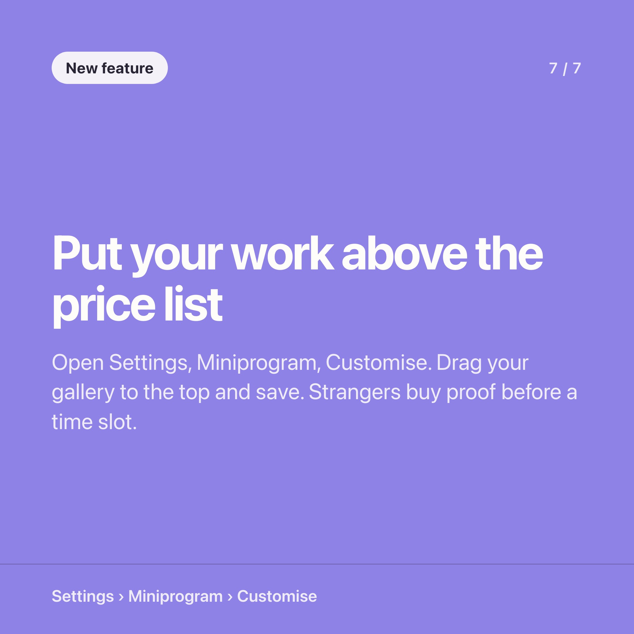
Settings → Miniprogram → Customisation → Customise. Do it on a laptop the first time; you are dragging things.
Pick the page you are editing from the dropdown at the top — Home is the one people land on. Add a section with Add widget, drag it into place, open it to set its content. Colours, fonts and button styles sit under Appearance.
Save writes to the live page. There is no draft mode and no publish step, which is the right trade-off for a page this small — but it does mean you should not "have a play" halfway through a Saturday.
The part worth ten minutes of your week
Two orderings, same shop.
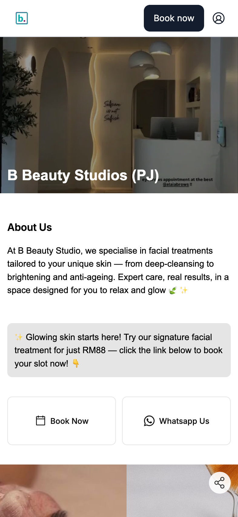
Default: name, services, book. Arranged: eight photos of last week's work, this month's offer, the three people who do it, then services.
The first answers "what do you sell?". The second answers "are you any good?" — which is the question a stranger from Instagram is actually asking.
You already have the photos; they are sitting in your phone. Ten minutes of dragging puts them in front of the one audience that matters, on the page where the booking happens.
While you are in there, two settings worth knowing about. Hide prices (under Booking → Booking experience) takes every figure off the public page, for the clinics and aesthetics businesses that quote after a consultation.
And the Book page has its own section order, so the flow a returning customer sees can be shorter than the shop window a new one sees.
What it is not
It is not a website builder. There is no separate domain, no blog, no landing-page builder, no pixel-level control of the layout.
It is a booking page that you can arrange — which, for most salons, is the honest version of what the Linktree-plus-Instagram-bio stack was doing anyway, with the booking built in instead of one tap away.
One rough edge worth naming: the Photo block currently only appears on the member profile page, not on your home page. Add it there and nothing breaks, but nothing shows either. Use Carousel or Gallery for images on the home page.
If you want the next layer
Arranging the page is free, forever, on every plan. The paid layer on top is Miniprogram Pro — your customers sign in, see their own bookings, packages, vouchers and receipts, and carry a member card in Apple or Google Wallet.
That is a different post, and a different job: this one is about what a stranger sees, that one is about what a regular gets.
Start with the free half. Open the editor, put your best eight photos at the top, and send the link to one customer who has never seen it. Their first reaction tells you more than any analytics screen will.
Not on bookit yet? The trial includes the booking page and the editor from day one.
Read next
- The booking page sections worth using — what each section is for, and the order that works
- Stop paying for Linktree — collapsing the bio-link stack into your booking page
- Miniprogram or Miniprogram Pro? — the one question that decides whether you need the add-on
- Set up Miniprogram Pro — the login page, the profile order and the wallet card, in twenty minutes